Type West Online, Term 1, Spring 22
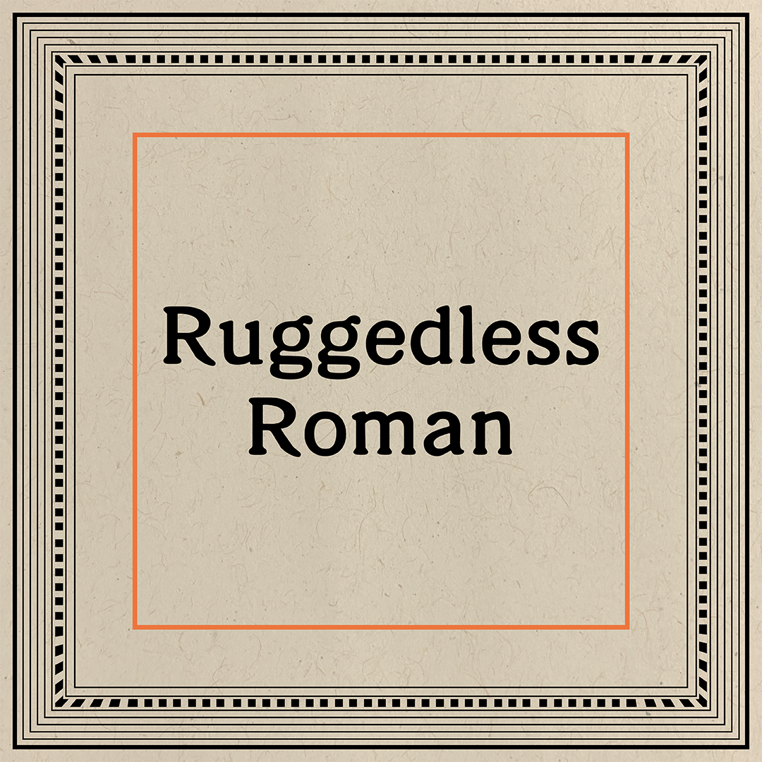
Ruggedless Roman
Bree Rice
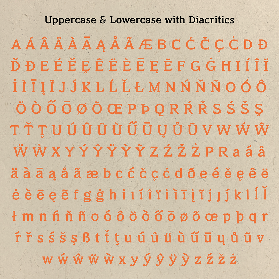
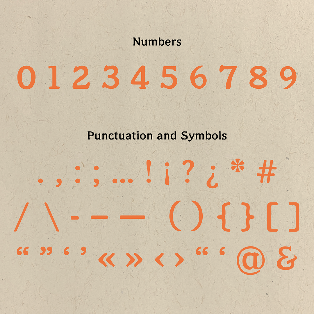
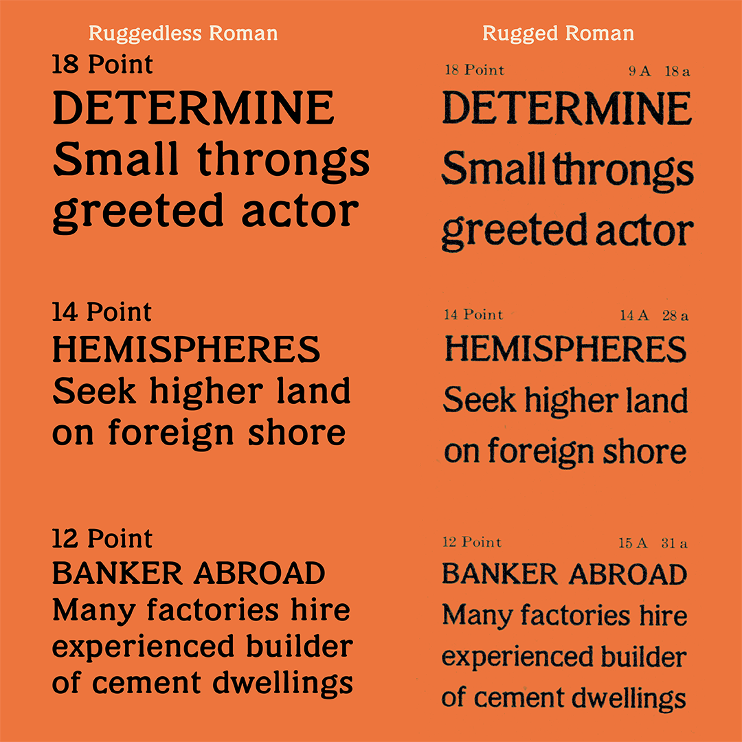
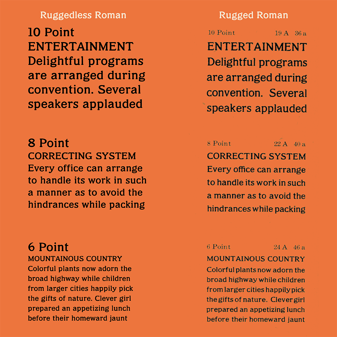
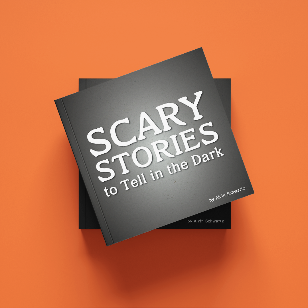
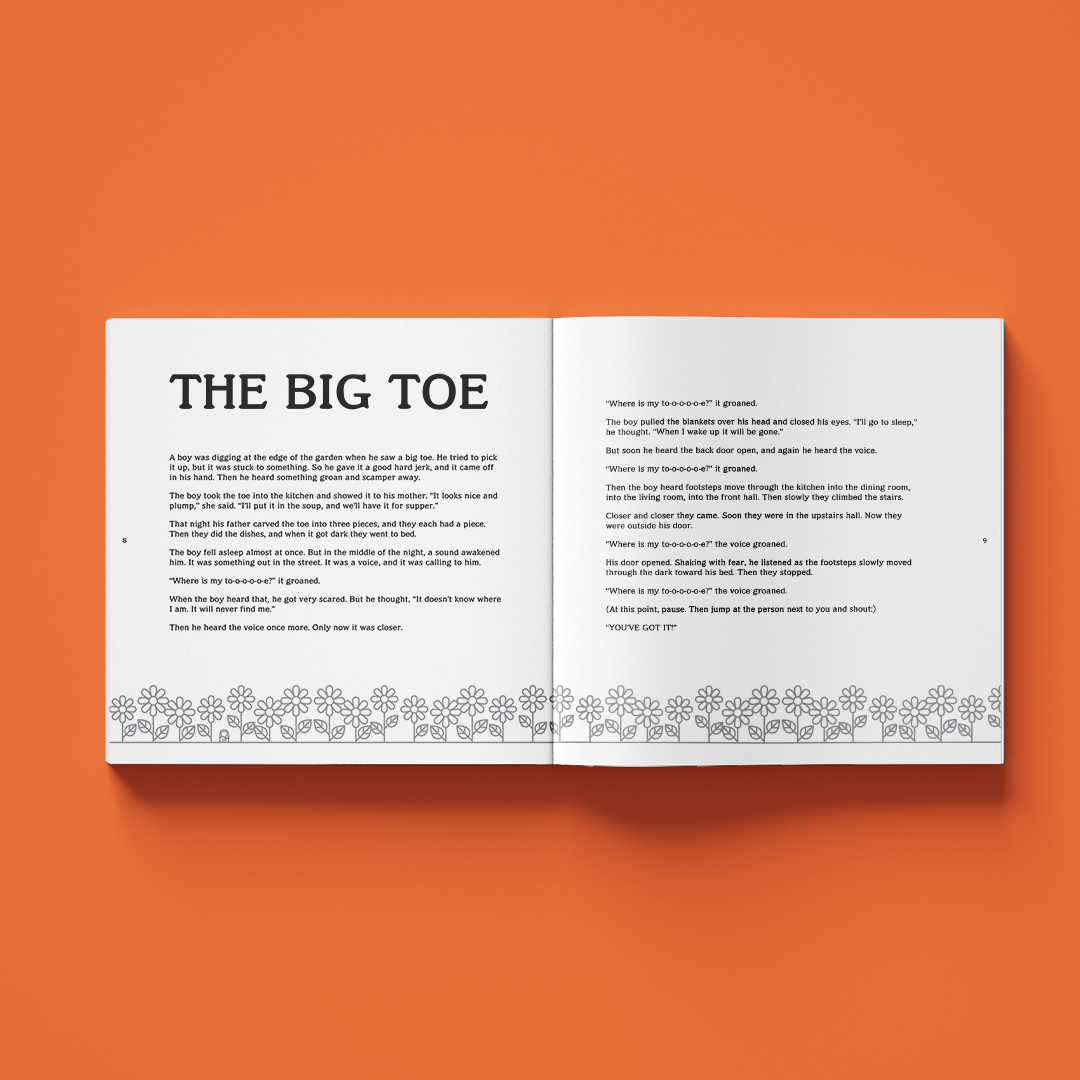
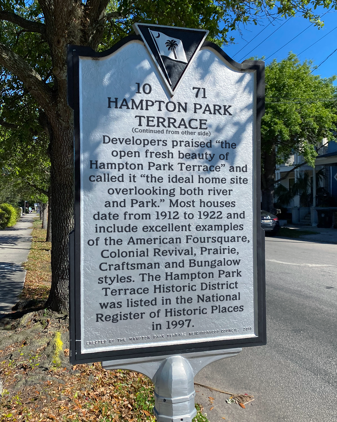
Ruggedless Roman is revived from the typeface Rugged Roman which was designed by Morris Fuller Benton at American Type Founders Company from 1909-1911, and debuted in 1917. My main modification to the typeface was stripping its bumpy features while trying to keep the letterforms as true to the original shapes as possible.
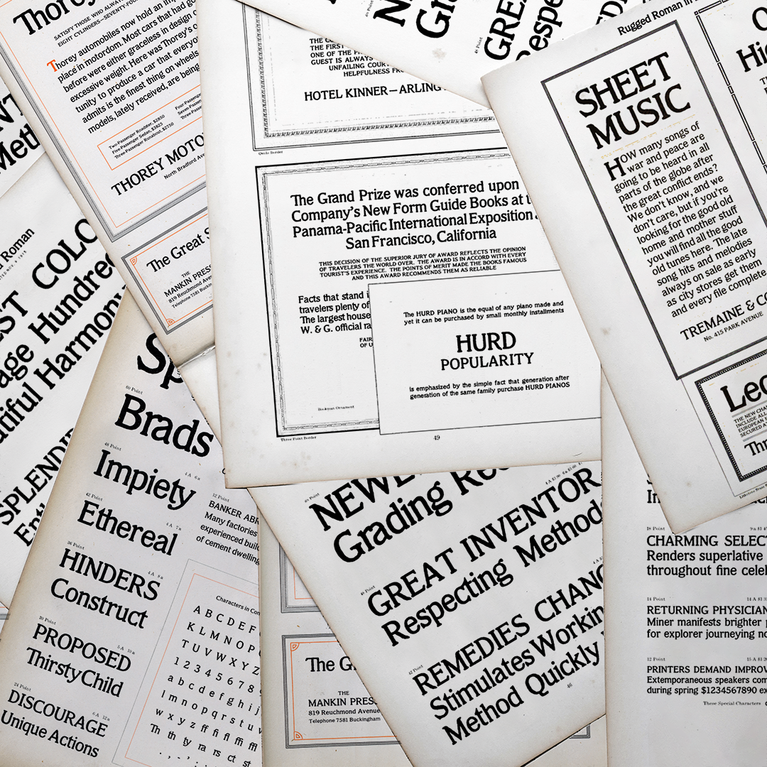
I started by tracing the letters that I had in the largest point sizes and using those as reference for the smaller point sized letters that weren’t as clear. This wasn’t helpful because the larger letters were thinner and narrower. I tried projecting and tracing the letters before digitizing but realized that I didn’t need to spend time doing that because I had such clear scans and I could use that time to tweak my letterforms instead.
Then I focused on the smaller point sizes. At the beginning I struggled with proportions. My capitals were heavier and taller than my lowercase letters. I had to scale everything up to get the right metrics. To start spacing I lined my font up and spaced it on top of the specimen to try to match the original, but that seemed too tight for a text typeface and I eventually started to trust my eye instead.


Bree Rice
Bree is a freelance designer, marketer, and chips and salsa aficionado. She specializes in brand collateral and standards, signage, and print collateral, such as billboards, editorial pieces, and mail, but also has a strong passion for letters. When she’s not working, you can find her swimming, traveling, or hanging out with her Australian Shepherds.
