Type West Online, Term 1, Spring 22
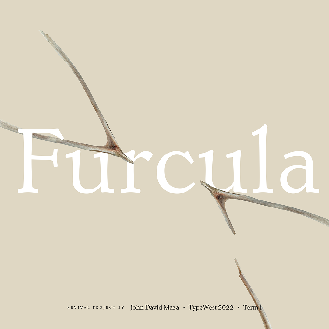
Furcula
John David Maza
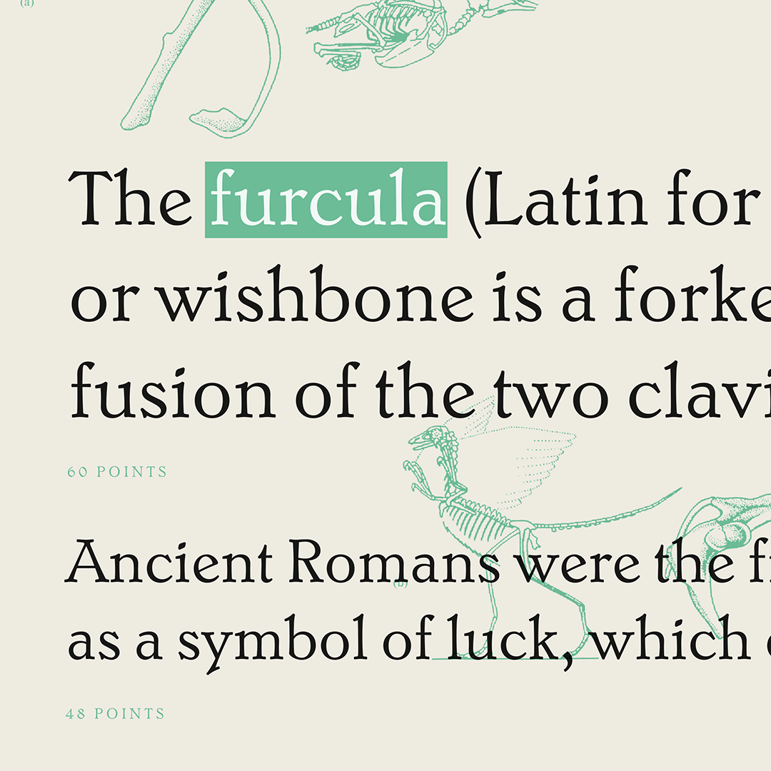
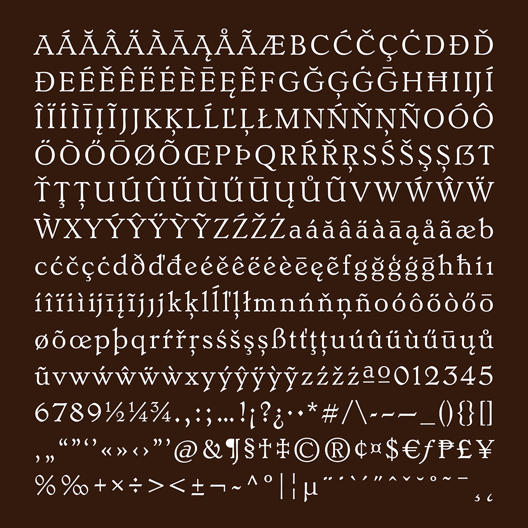
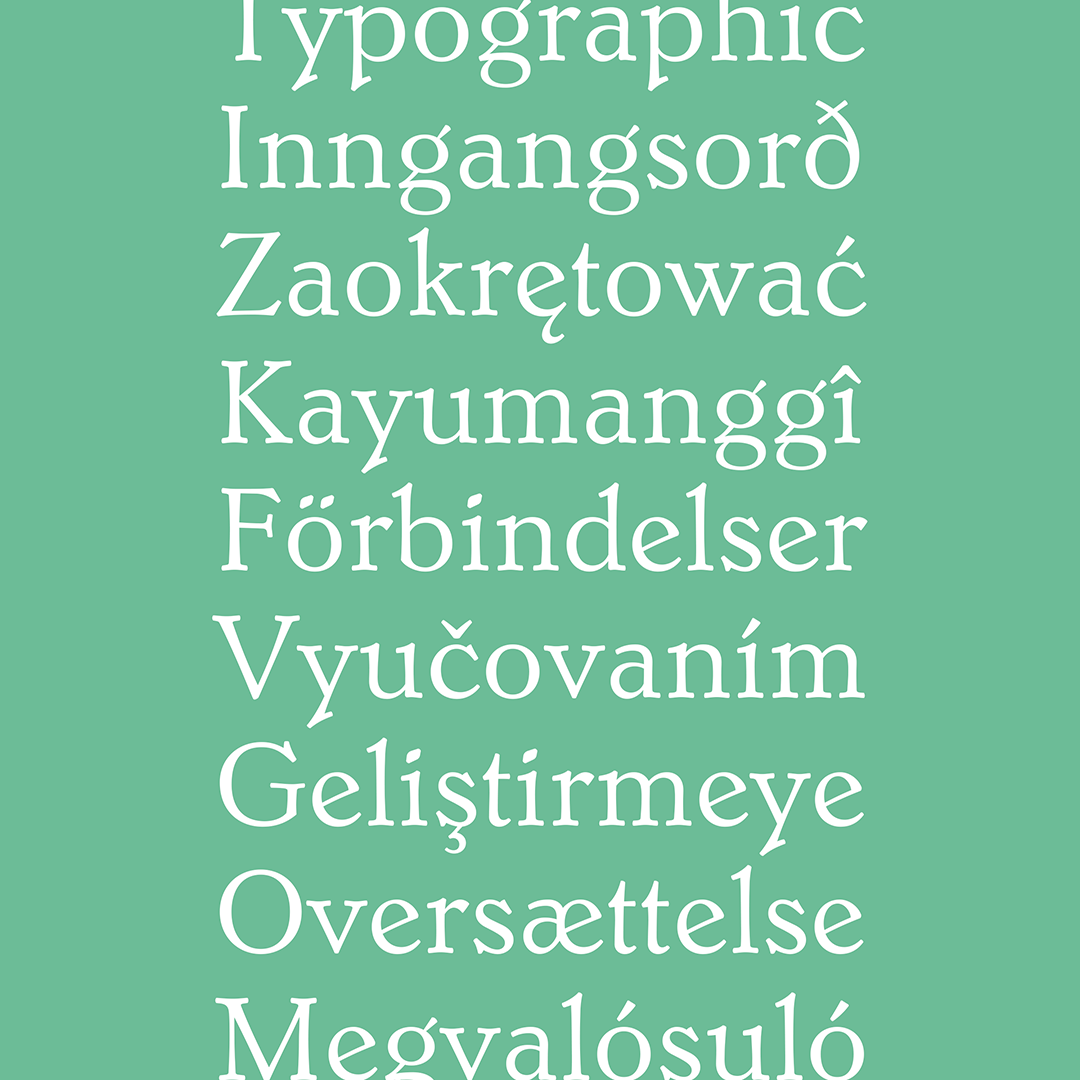
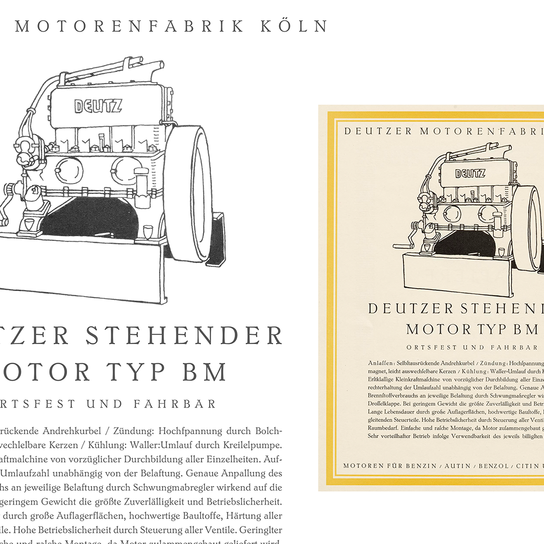
Furcula is my text typeface revival project based on a specimen of Jakob Erbar’s Erbar Medieval at 10 points. The name came from the way the shape of the serifs looked like the larger piece of a cracked wishbone.
The finials, large counters, and overall breath of the original typeface are what drew me to choose it for my revival. Due to the physical constraints of early metal type, the challenge for me was to even out the texture and spacing while preserving the warmth of the typeface in the scan.
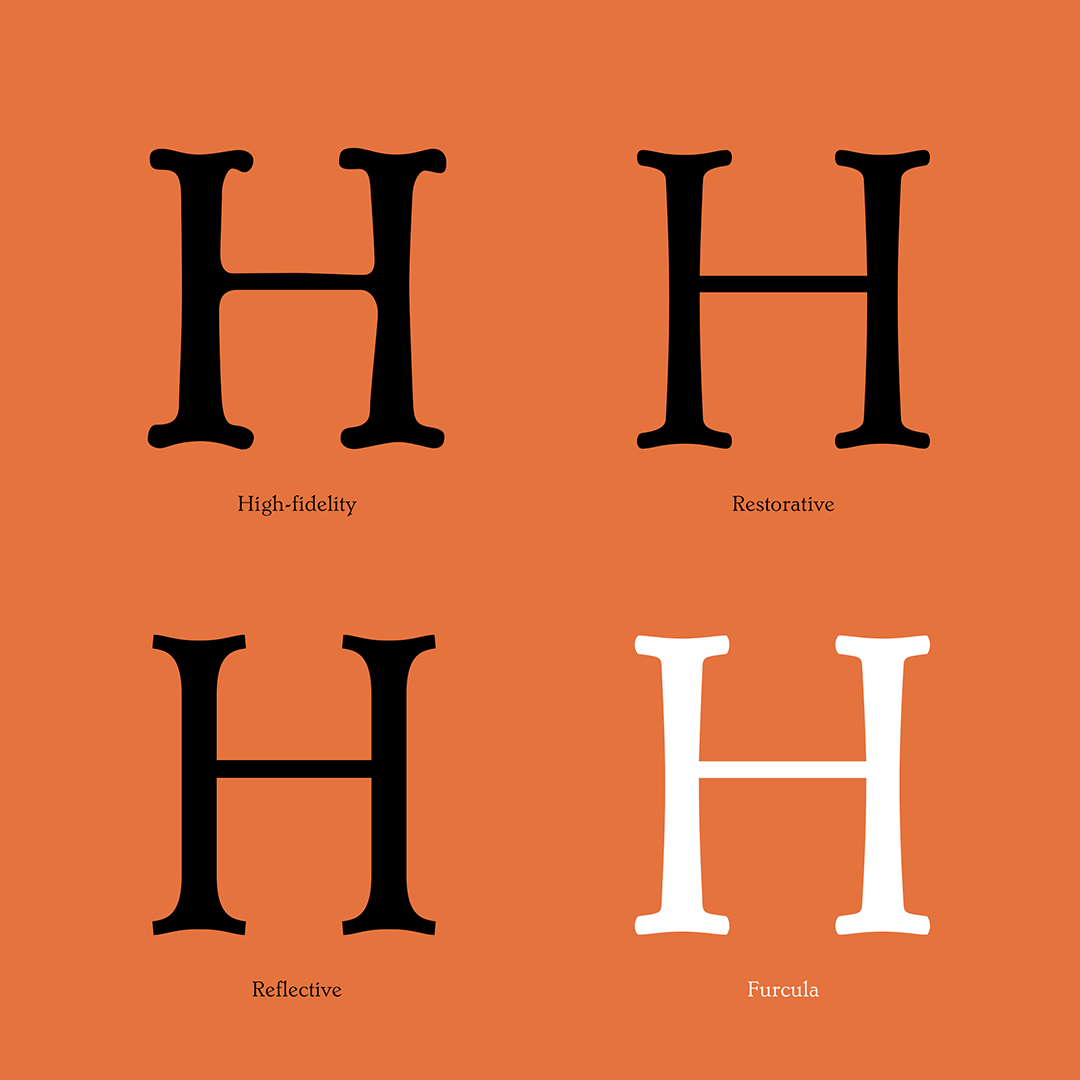
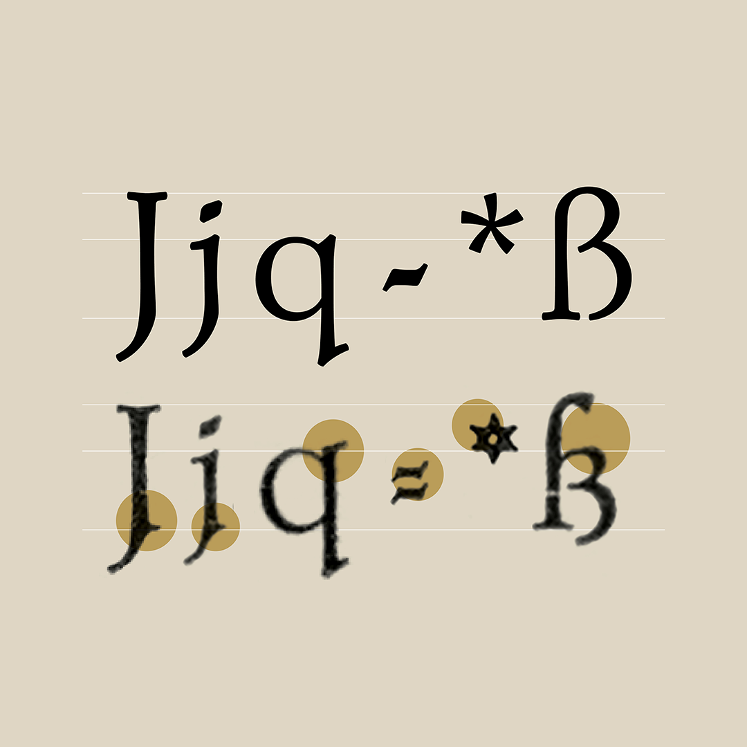
The process began by tracing a snapshot from the reference material using 3 different approaches: 1) High-Fidelity tracing, where inconsistencies observed in the specimen were included, 2) the Restorative approach, where the softness of the edges and curviness of the glyphs were preserved, while being constructed in a uniform manner and 3) the Reflective approach, where I tried straightening all the sides to make it even more uniform, but the result looked too sharp and rigid. The end result were serifs that are neither too sharp nor too rounded, a mix of both the Restorative and Reflective approaches.
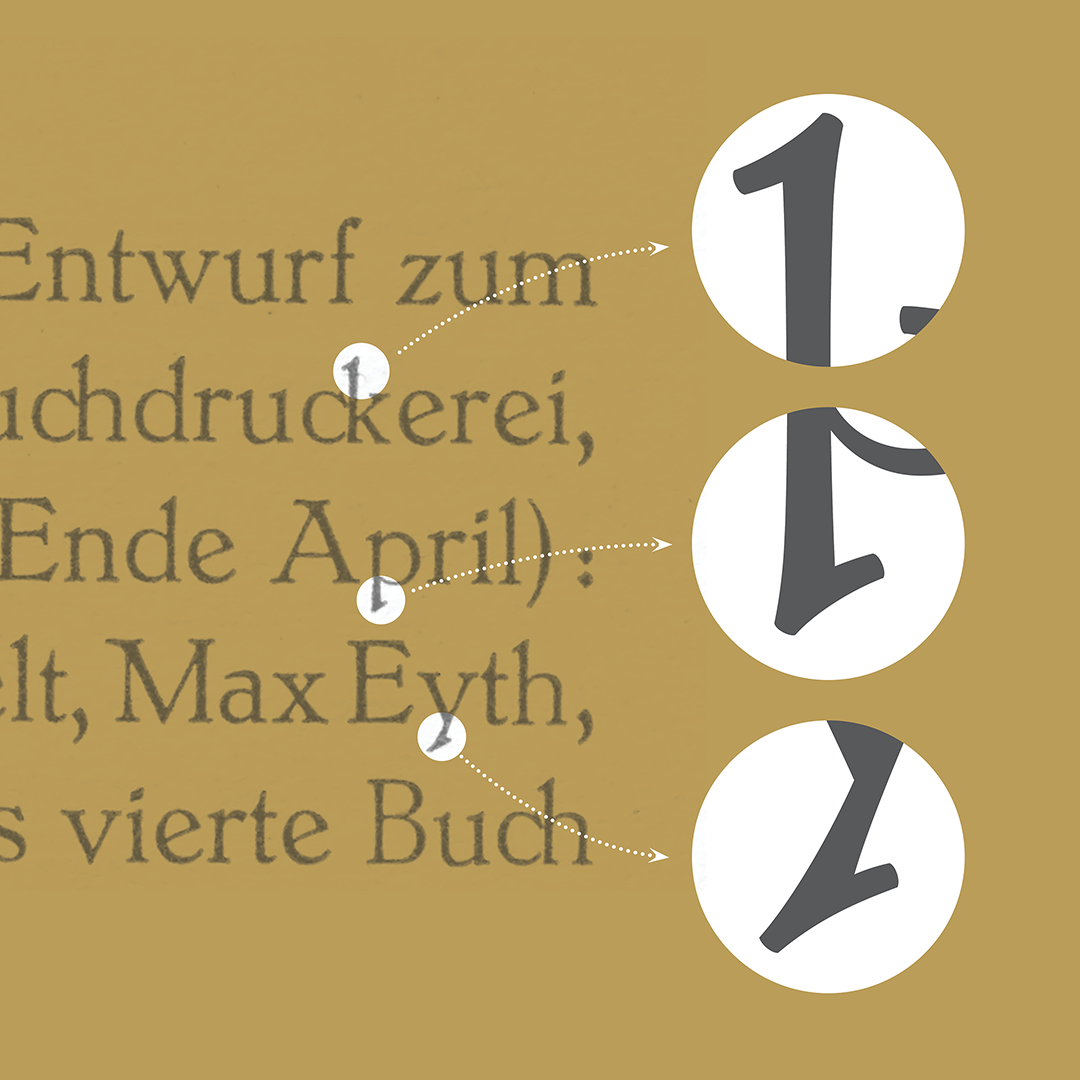
Along the way, we had to make adjustments, deviating from the source for some of the characters to improve the readability and cohesiveness of the design in today’s context: the height of the figures and the size of diacritics were adjusted to balance with the uppercase and lowercase letters, the spurs originally found in the specimen were removed, and some symbols were drastically redesigned to become simpler, more recognizable, and related to the rest of the forms.
John David Maza
Jad is a Filipino designer based in Iloilo, Philippines. His work is focused on type, graphic, and editorial design.