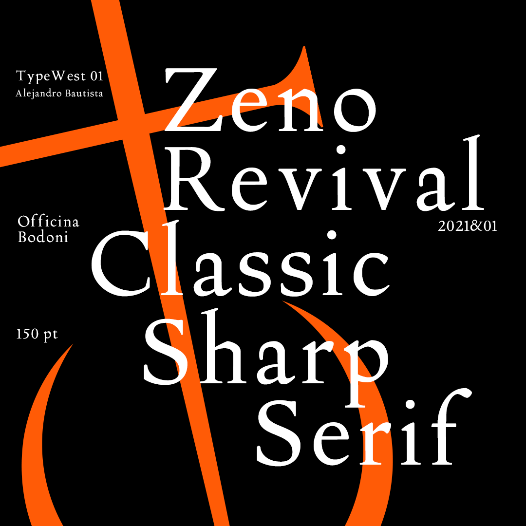
Type West Online, Term 1, Spring 22
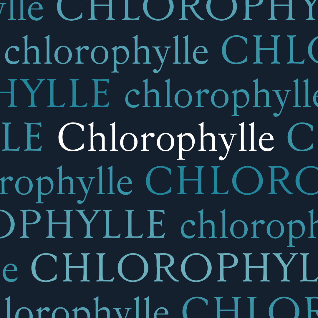
Chlorophylle
Carine Vadet-Perrot
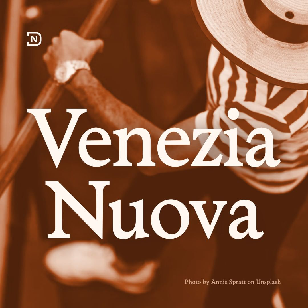
Blossoming from the 1857 typeface Beaudoire, Chlorophylle is the typeface that sharpened my eyes and my thoughts during my first term at Type West. Among all the options my research brought me, Beaudoire seemed to be at the same time a pleasure for the eyes, and comfortable for readers.
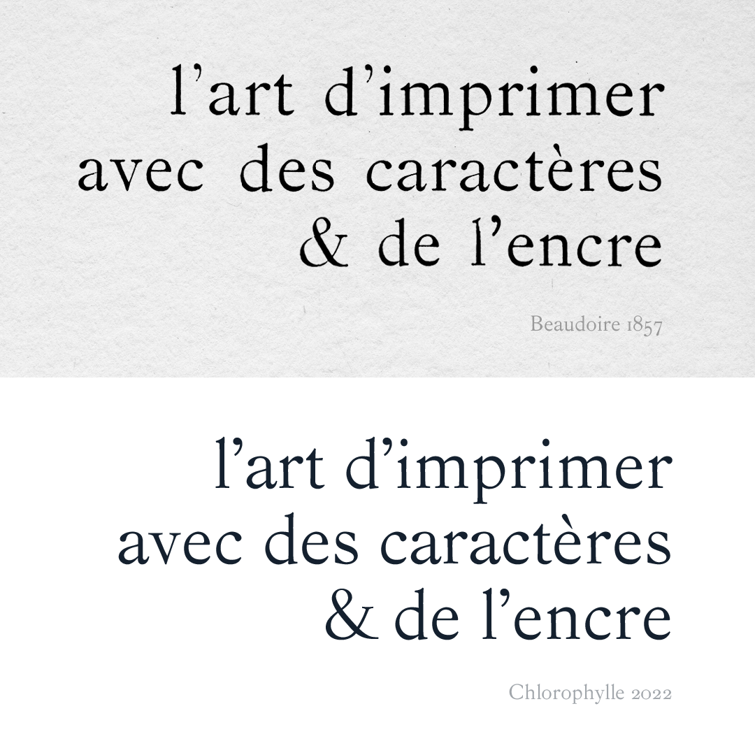
Théophile Beaudoire created his typeface at a time where the characters of Bodoni and Didot began to tire professionals and readers because of their high contrast. He was inspired by the characters printed earlier by the Elzevier family in the Netherlands. Their characters were first created in the 17th century, for technical reasons: they were intended to facilitate the printing of small books, able to circulate easily, even if they were prohibited. Realizing the political and cultural impact a typeface can have fascinated me.
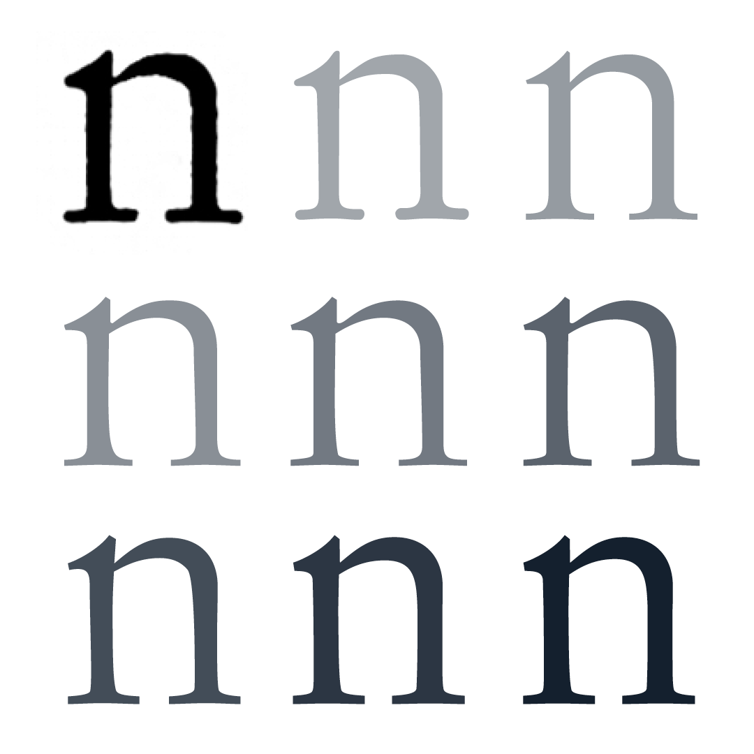
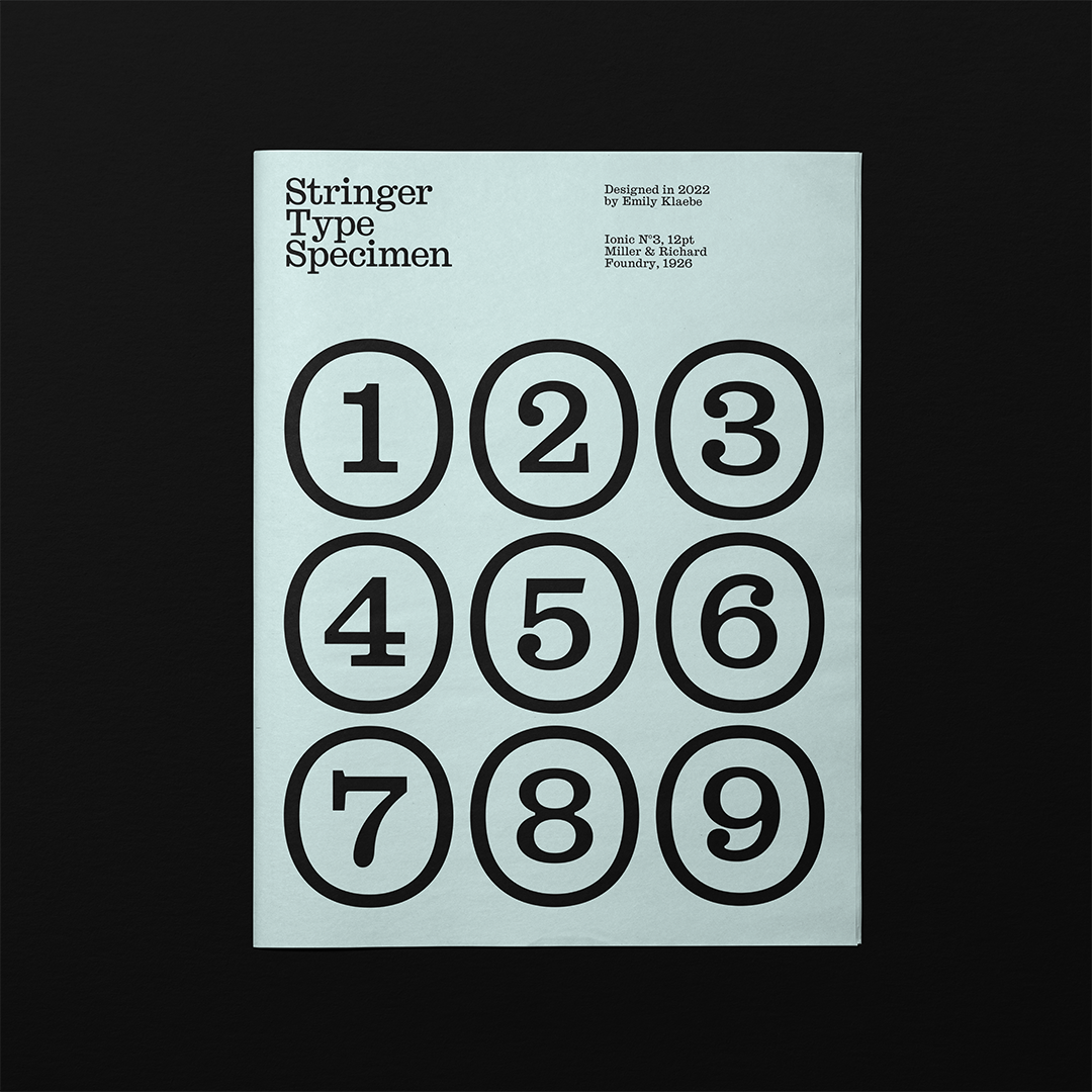
At first I thought it was possible to recover the initial shapes of the punch cutters, since all the information was there, printed on the paper. But once I started to digitize the letterforms, I found that even with high resolution scans, everything ends up being blurred if I go too much into detail. I learned to step back and I realized a revival is a process of filtering. This reminded me how plants filter light and water to produce oxygen, that’s why I named my typeface Chlorophylle (yes, with two “Ls”— that’s the way to write it in French).
I adapted the typeface for today’s use by balancing the shapes, adjusting the width on several letters, and harmonizing the spacing, which was particularly loose in the source. The original source was refined, and to keep this flavor I made the ascenders slightly taller than the caps.
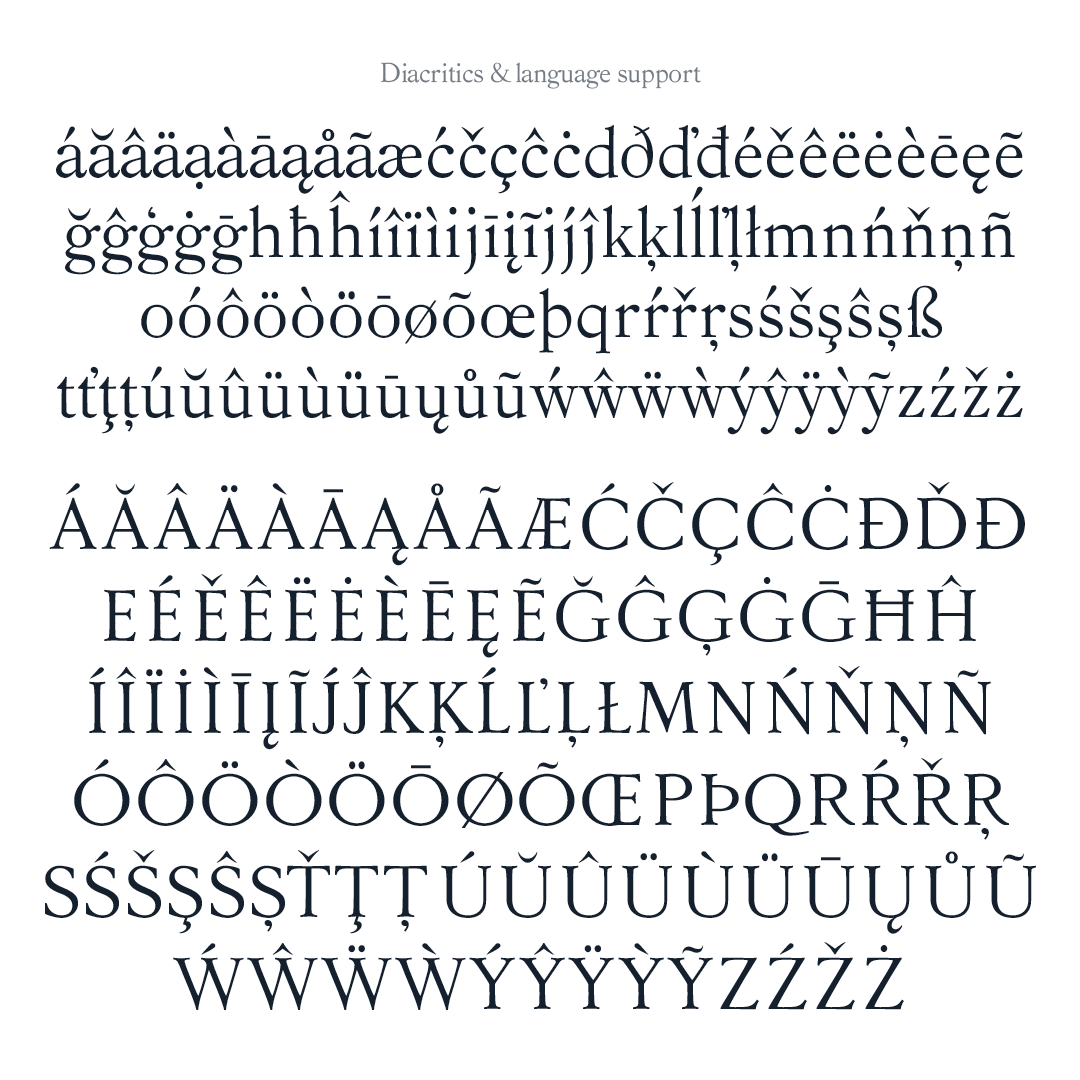
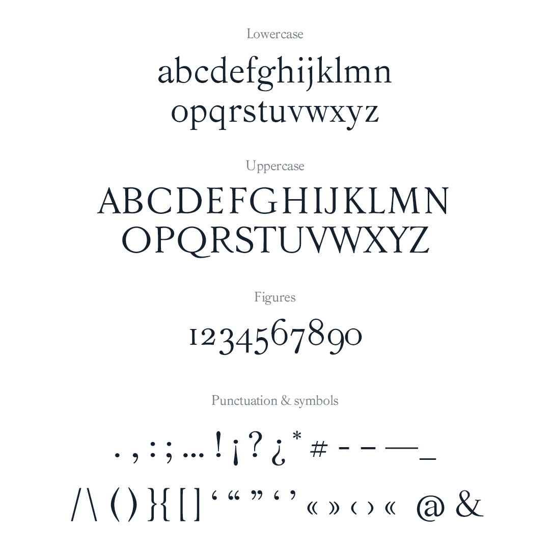
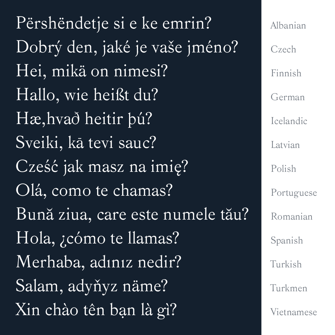
Designing the diacritics was challenging. This part led me to look at other typefaces to understand the construction rules by comparing the solutions found by other type designers. Little by little, designing the diacritics became surprisingly addictive, because I was motivated to see how only a few glyphs more can make my typeface suitable for more languages and useful to more people. Making a typeface suitable for as many languages as I can is my way to expand our horizons and welcome diversity.
Carine Vadet-Perrot
Carine Vadet-Perrot lives in Brittany, France. She designs brand identities, bespoke stationery, and typefaces. For her, writing systems are key to connect humans and open our minds.