Type West Online, Term 1, Spring 22
Hajduk Antiqua
Jo Malinis
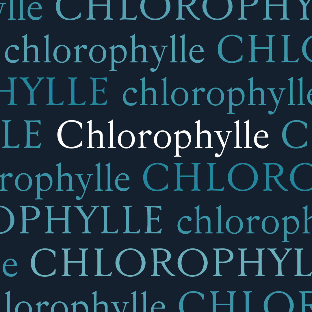
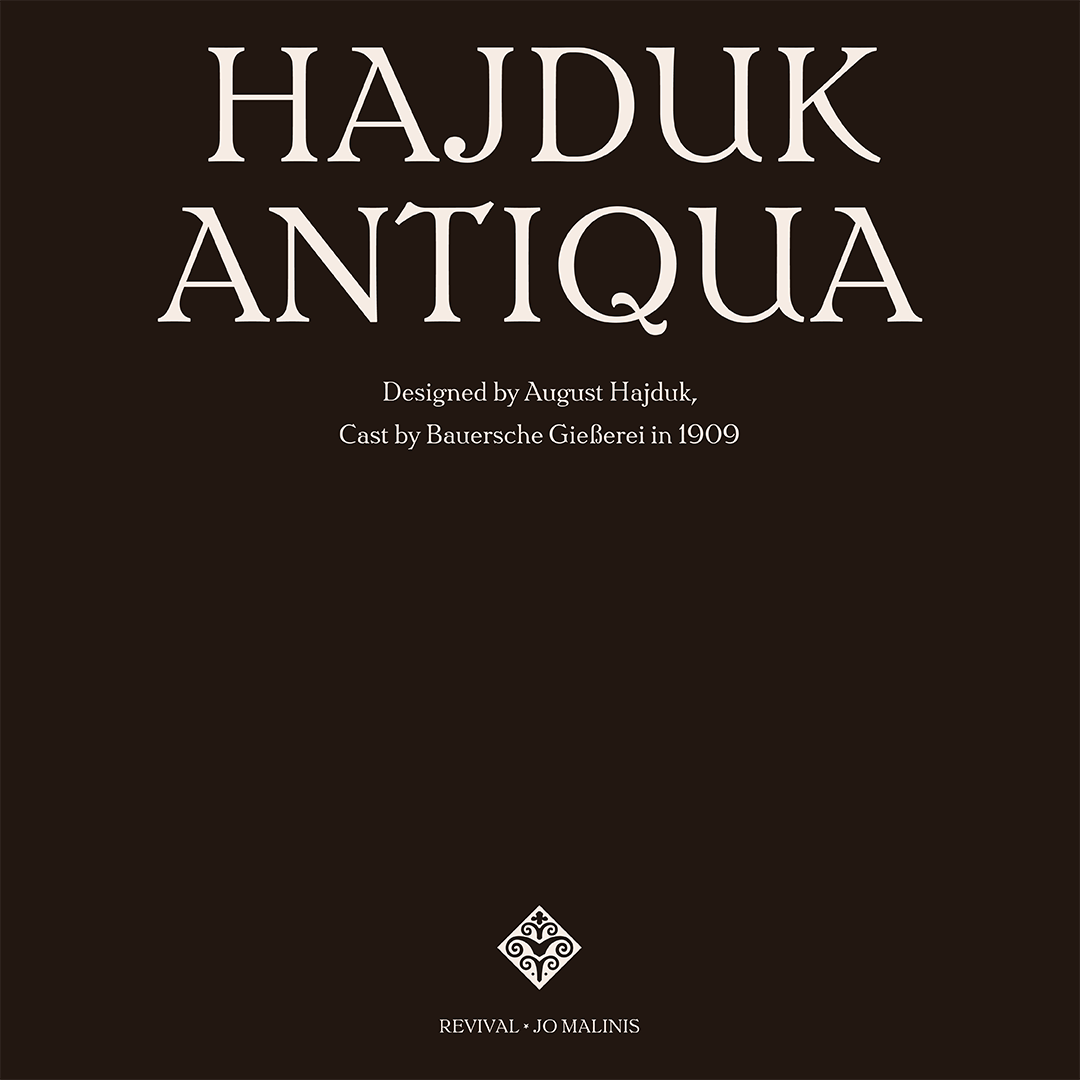
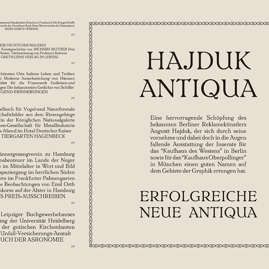
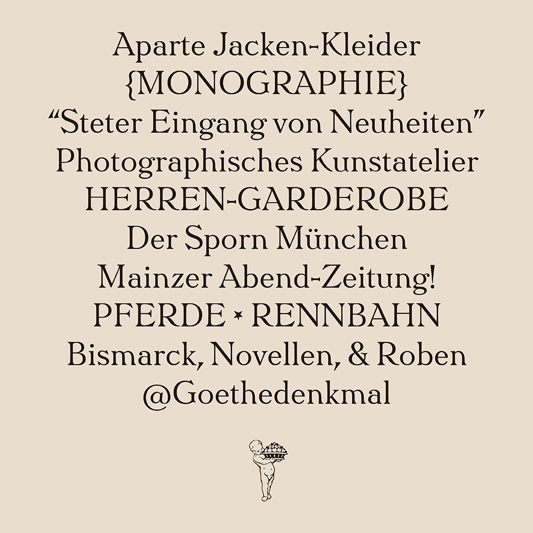
Hajduk Antiqua was designed by August Hajduk and cast by the Bauer Type Foundry in 1909. I was attracted to the large counterforms and quirky serifs from the display sizes, then slowly developed an interest in how the designer was able to capture warmth in his designs.
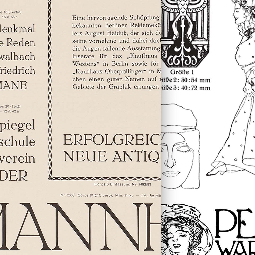
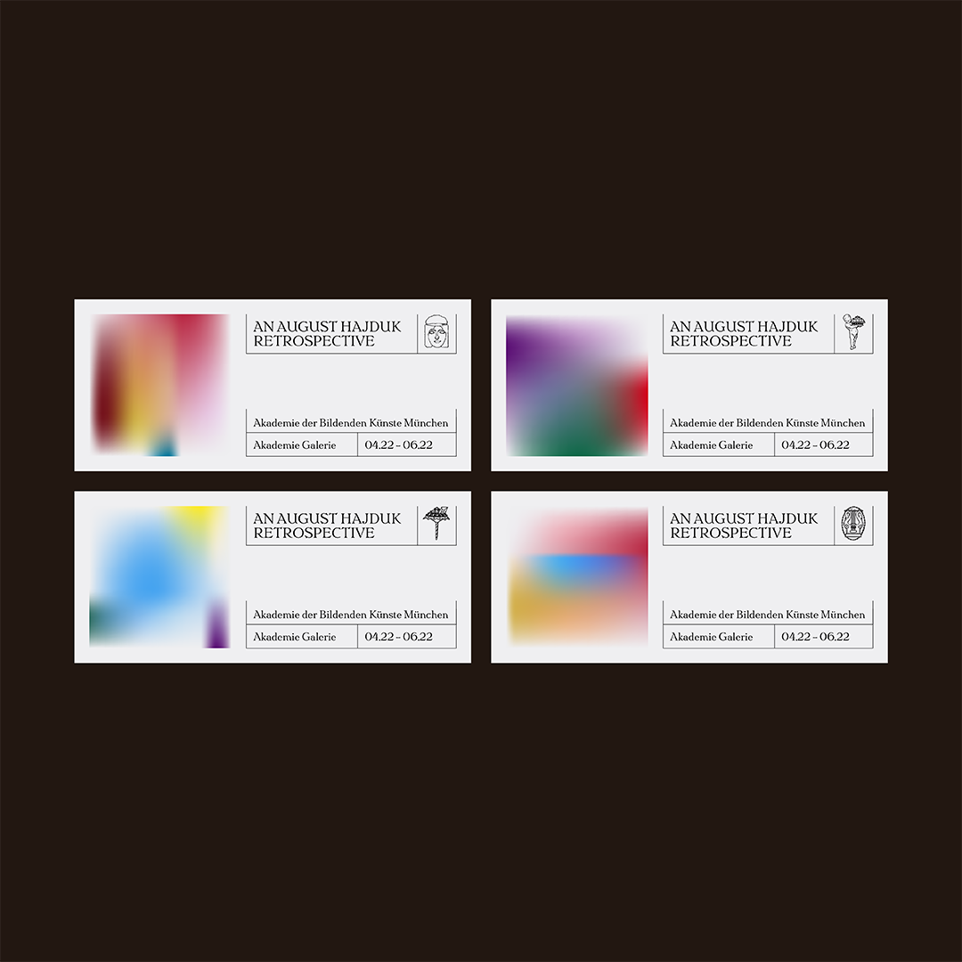
Because there is not much information on this typeface online, I researched August Hajduk’s background–which was in advertising and graphic design. I looked at some of the ads that he did and noticed that the same hand-drawn feel was present in his illustration and lettering work.

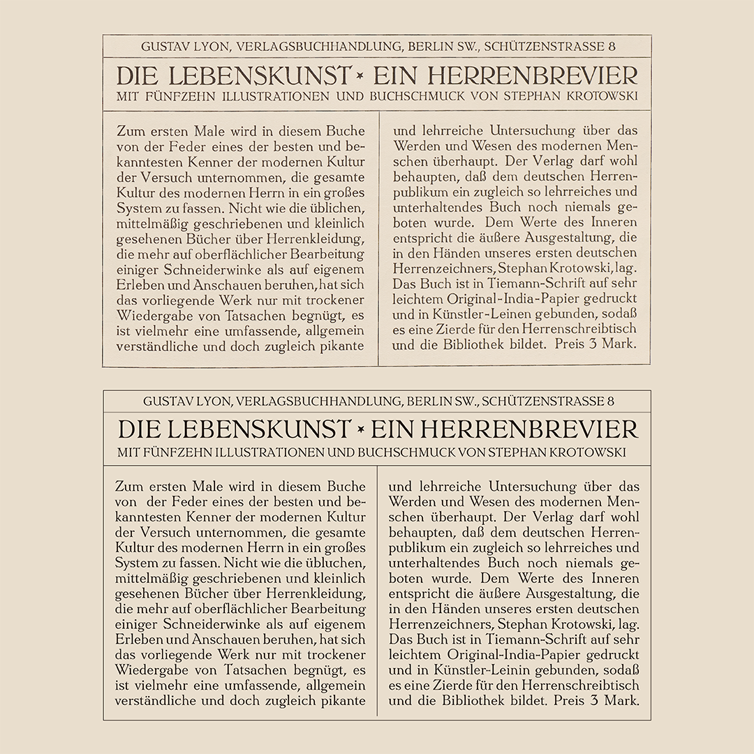
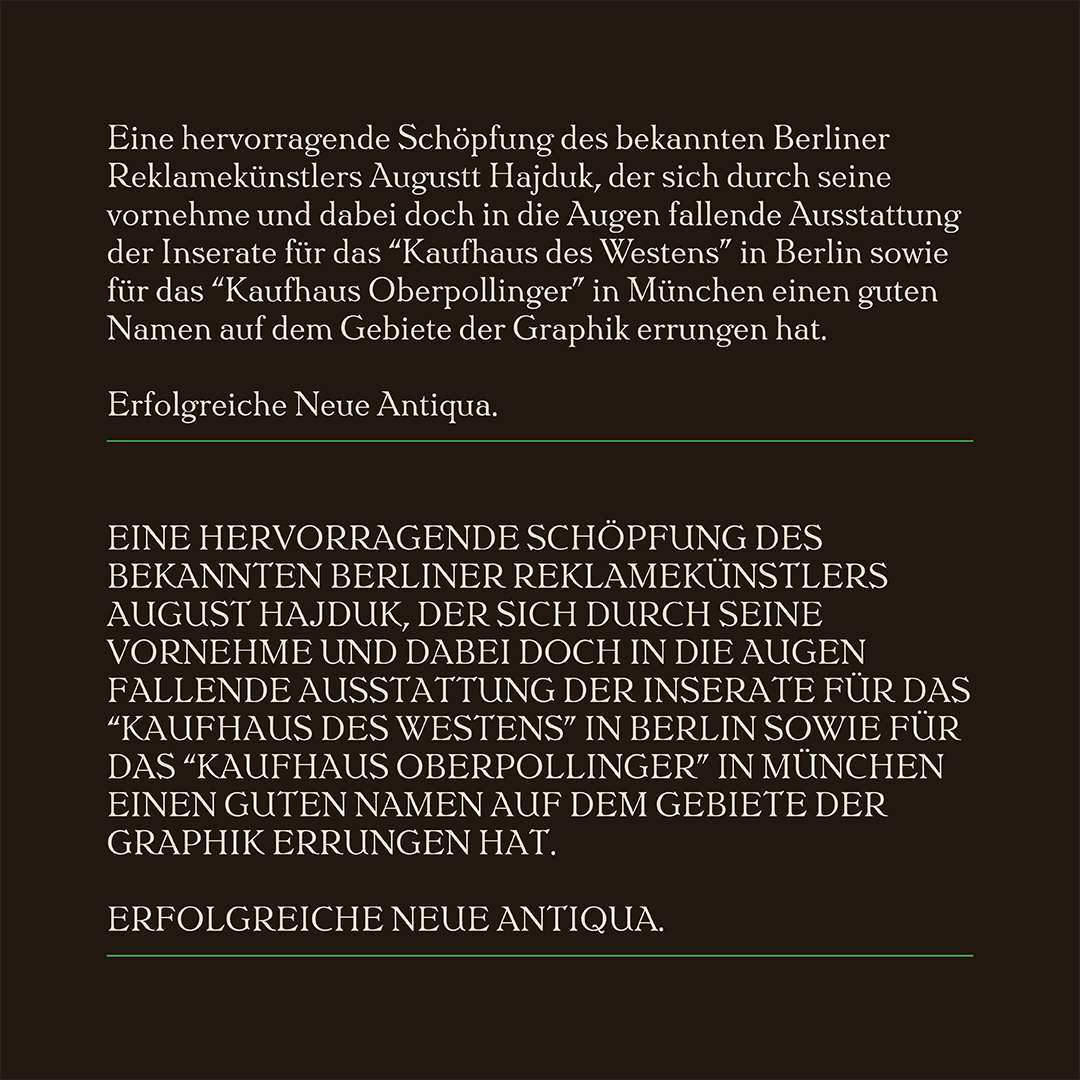
Apart from faithfully trying to copy the forms of each glyph, my main goal was to try to preserve the energy of the original specimen. I made sure that no sharp corners would be present in the verticals, and most lines would have a very slight concave to them. Inconsistencies from the source specimen, like the differences in ball terminals and some other awkward forms, were things that I did not necessarily “correct,” but I made decisions to make them work better with each other.
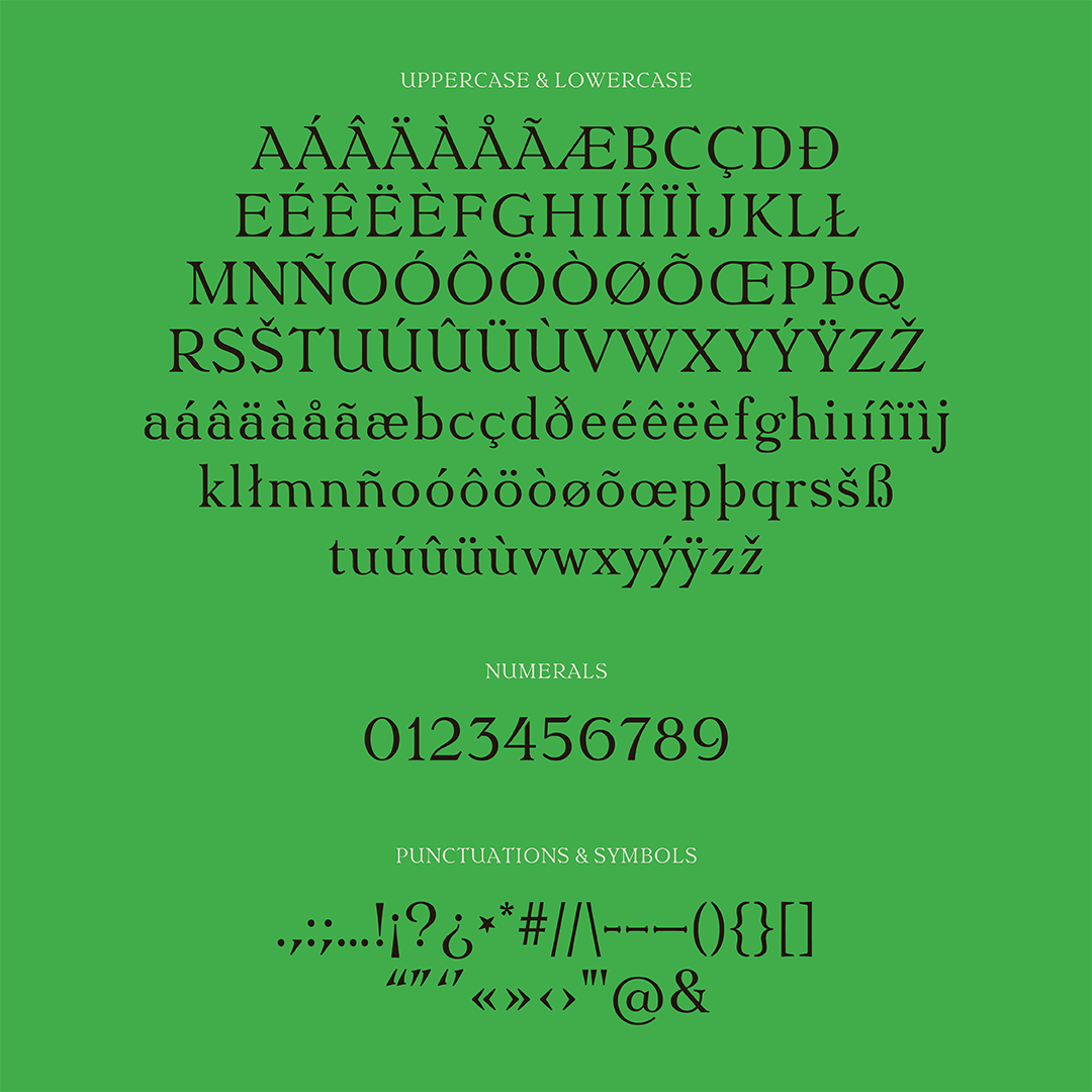
Some roadblocks that I encountered were trying to get the vertical metrics right, harmonizing the spacing of the uppercase and lowercase letters, and figuring out character proportions.
After going through all of these, I am proud to say that I am truly pleased with the outcome of this revival. I look forward to further developing it in the future.
Jo Malinis
Jo Malinis is a graphic designer and educator from the Philippines. Apart from working on brand identities, she is also fascinated by letterforms and how they can be representative of concepts and themes that inspire her personal and professional work. Jo founded Type63, an initiative that aims to serve as a platform to celebrate and showcase type design and typography by Filipinos.
