Type West Online, Term 1, Spring 22
Heyse Neue
Estefanía Leyva
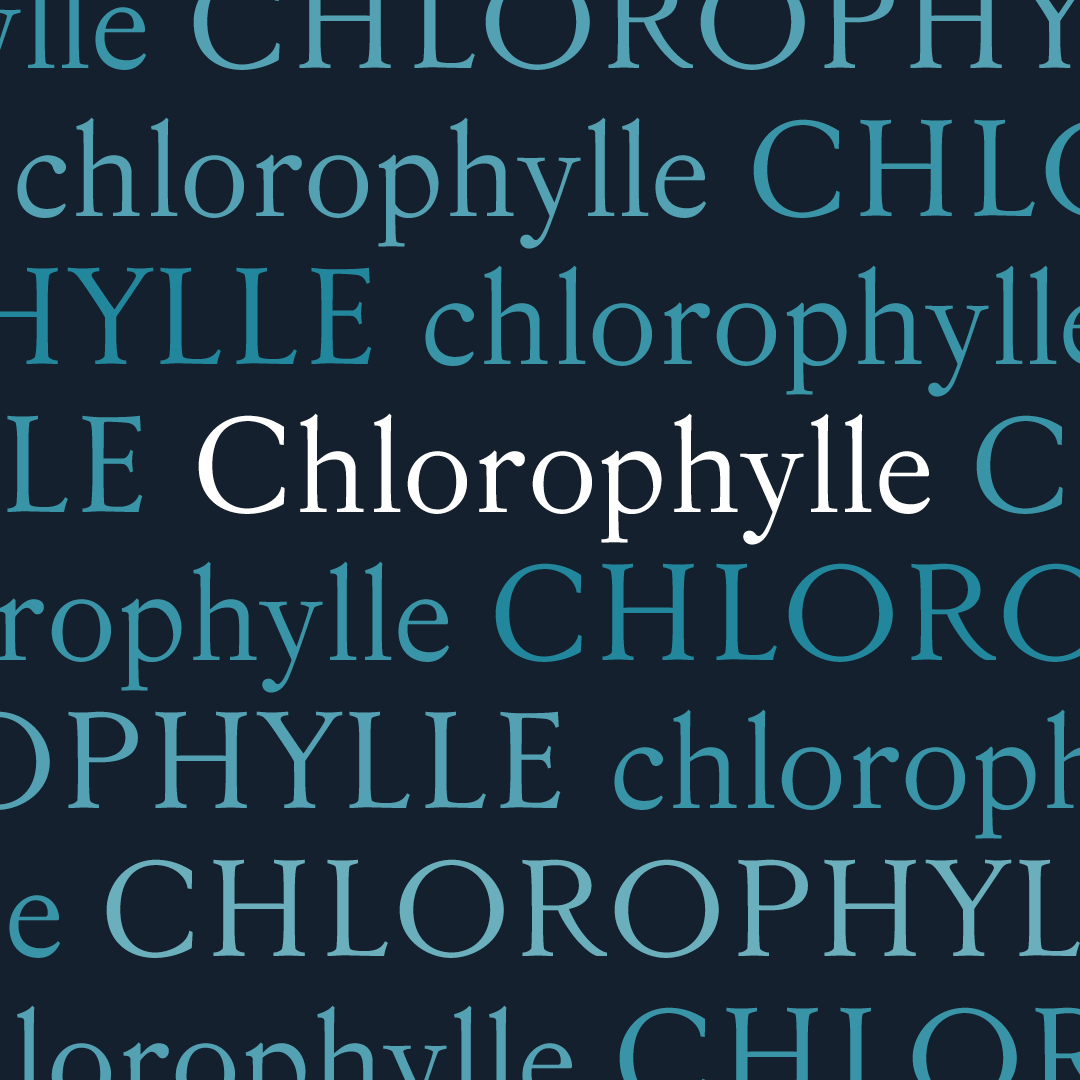
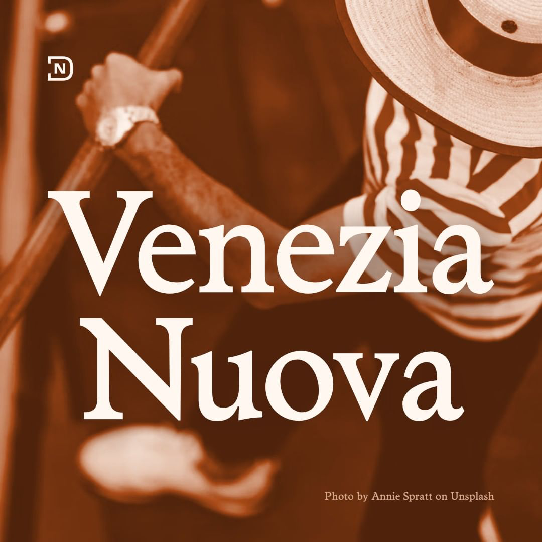
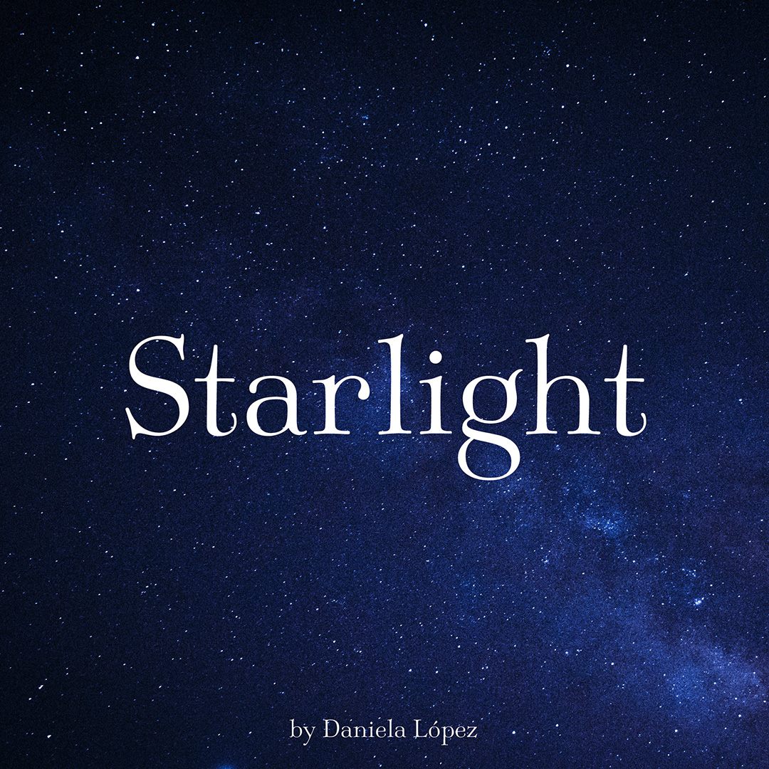
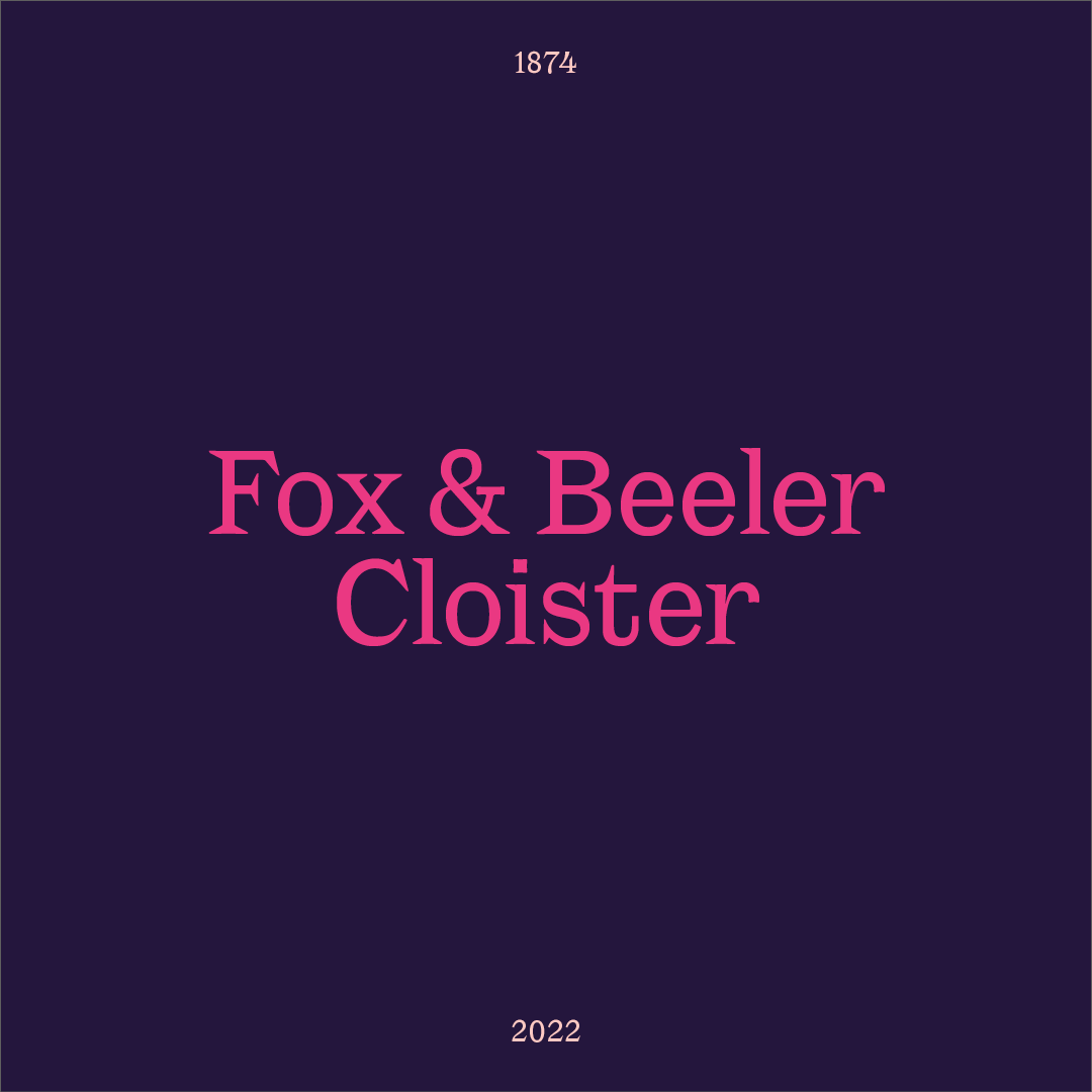
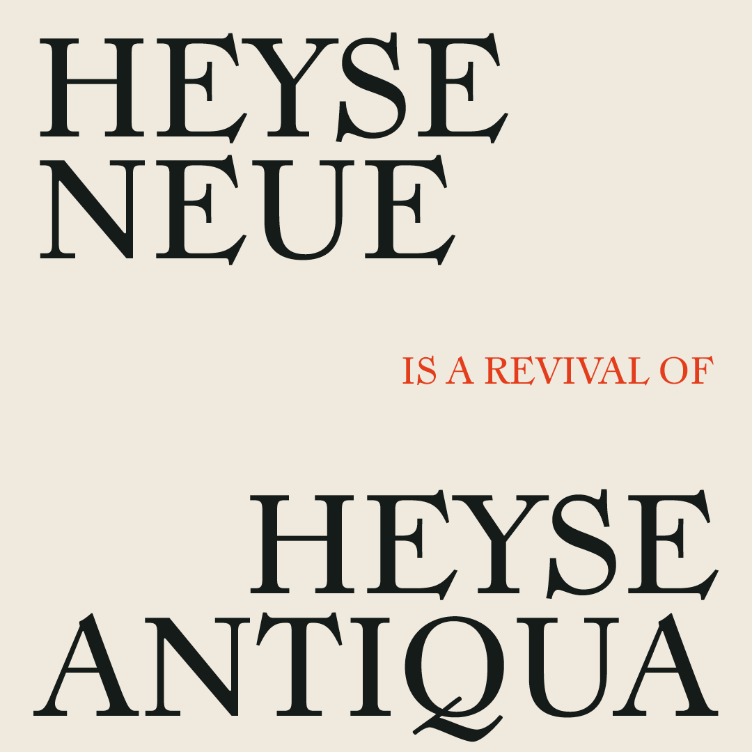
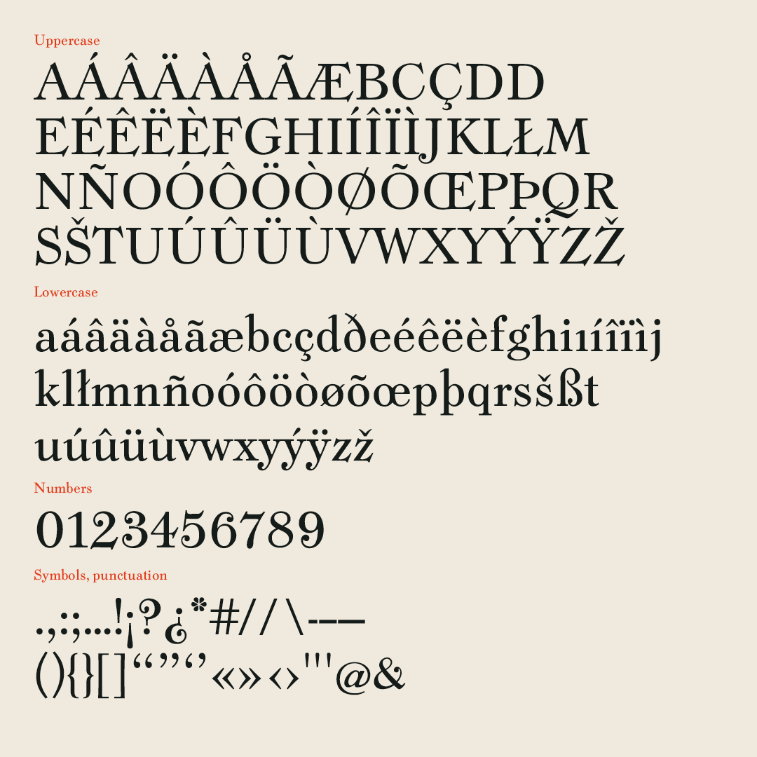
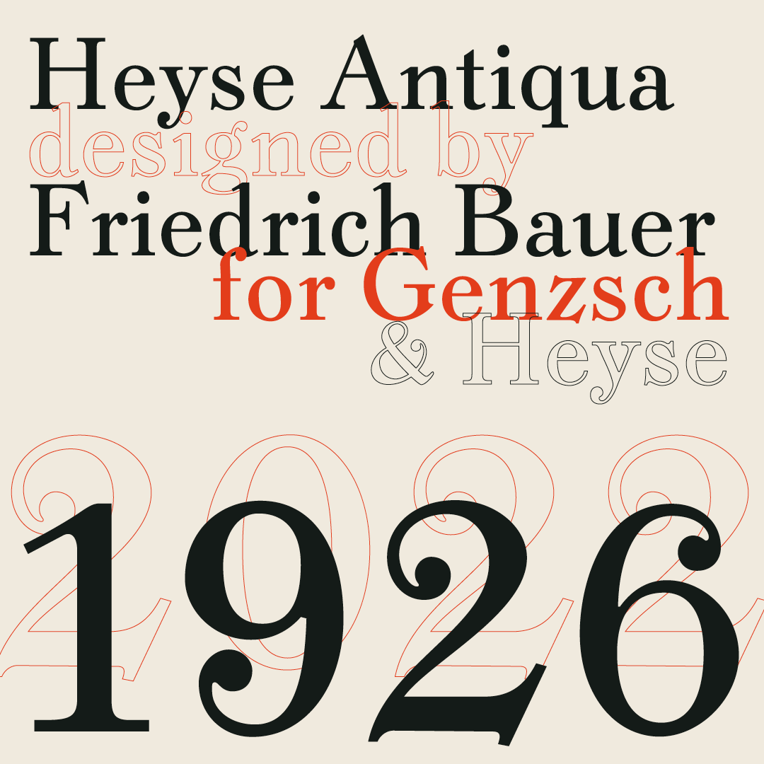
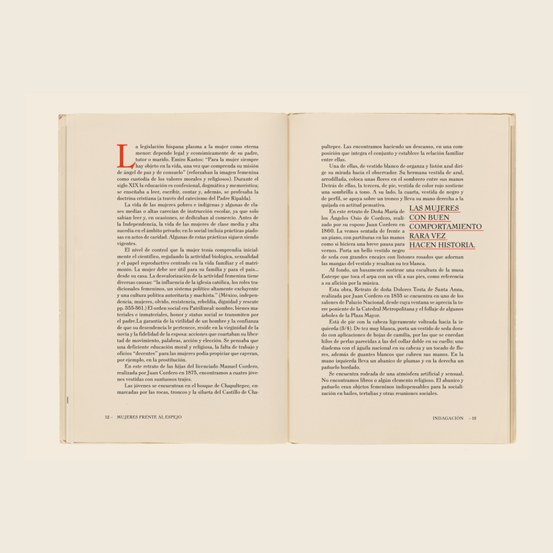
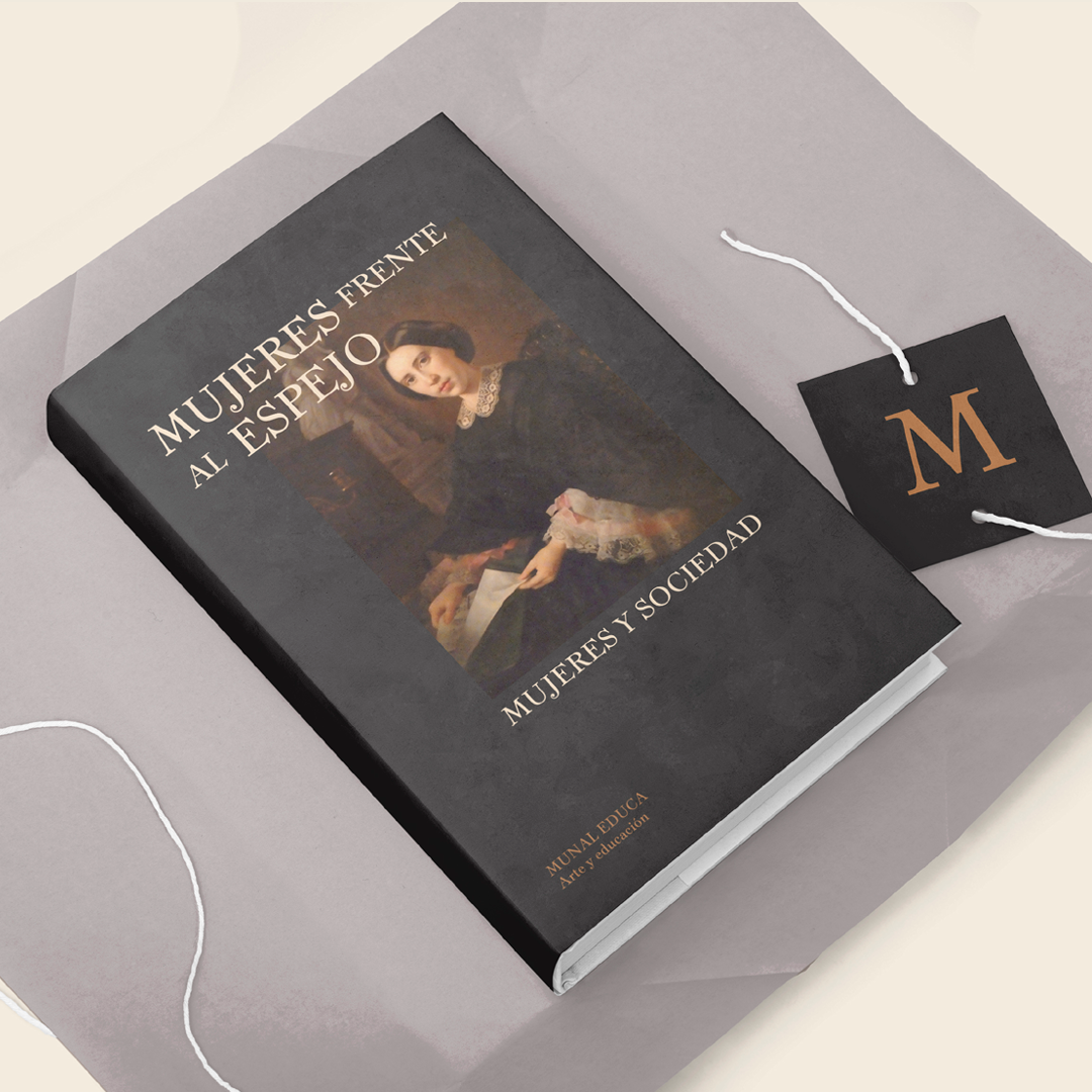
Heyse Neue is a revival of Heyse Antiqua, which was designed by german type designer Friedrich Bauer in 1926 for the german type foundry Genzsch & Heyse. The initial goal for this project was to design a text typeface and to try to respect as much as possible the original design, to make it more restorative than interpretative. I was drawn to the typeface because of its contrast and proportions and upon more research I found that it was thought to be a modern font, with really simple and quiet forms, so I tried to keep that through my digital reinterpretation.
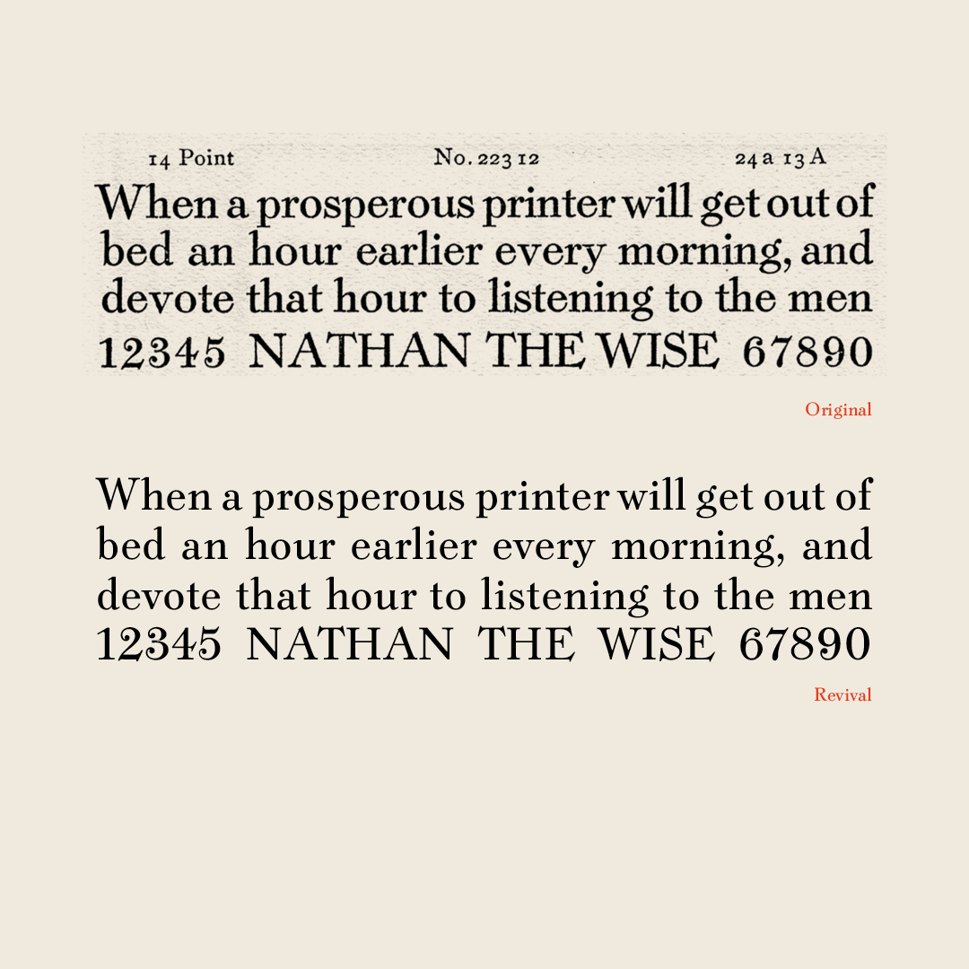
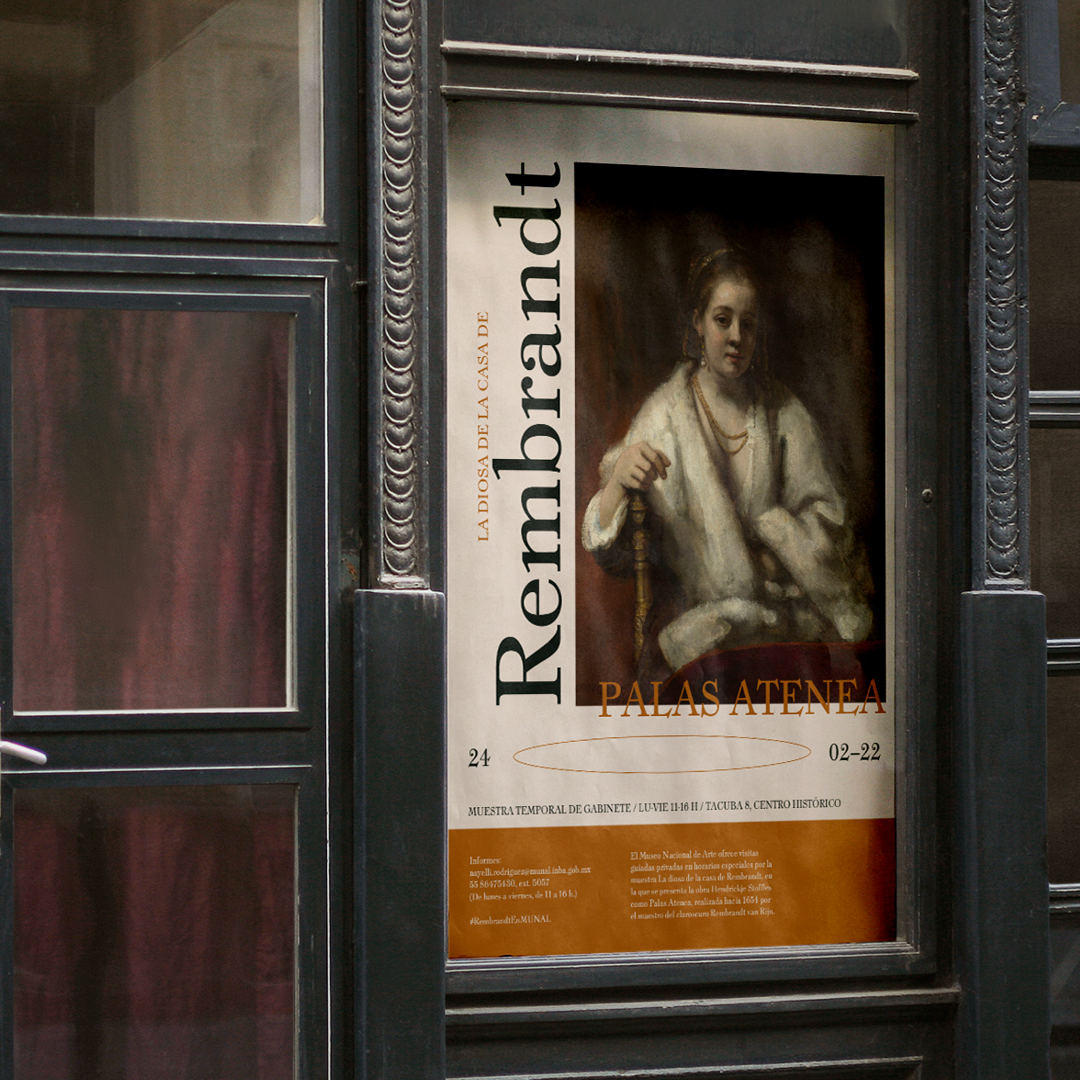
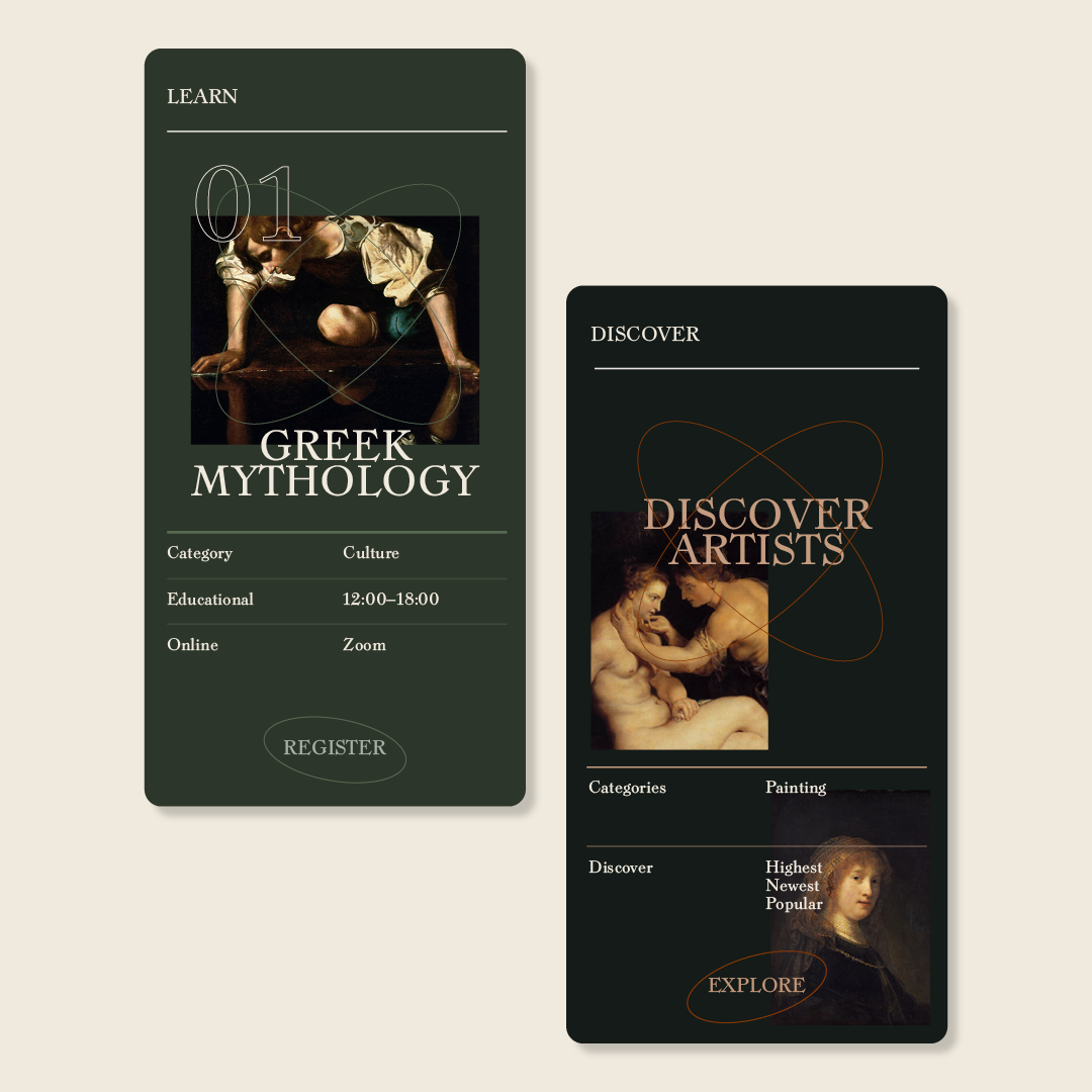
For this project I had the goal to take and keep the letterforms that existed on the original design, but also try to imagine how it would be designed in today’s time, and how it would look and work in the media we have today. Since the original design worked as a text but also a display type, I tried to stick to the smaller sizes to base my design on.
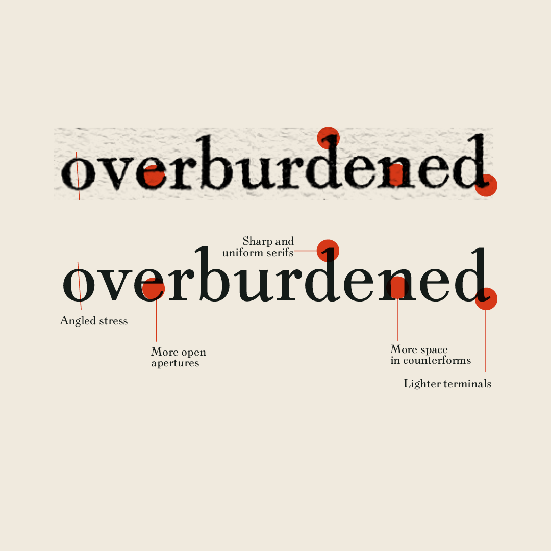
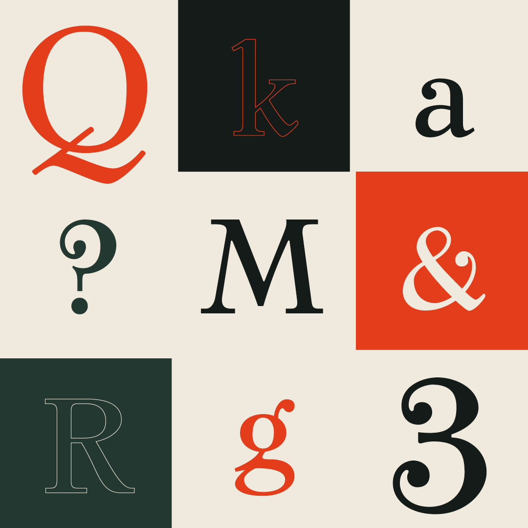
Along the way there were some challenges in trying to understand some of the shapes and the contrast, as there were some letters that did not match that well with the overall stress, so I had to modify some of these to make it work better in the whole system. I always kept in mind to only make modifications in the shapes of the letters whenever necessary to make it functional and more cohesive. It was a project full of learning and it helped me understand better how text faces work and the importance of white space in all parts of type design.
Estefanía Leyva
Estefanía is a mexican graphic designer with a special focus in editorial design and an aspiring type designer with big love for letters in all its forms. Always passionate for learning and to share her learnings, she also teaches Typography and other workshops.
