Type West Online, Term 1, Spring 22
Stringer
Emily Klaebe
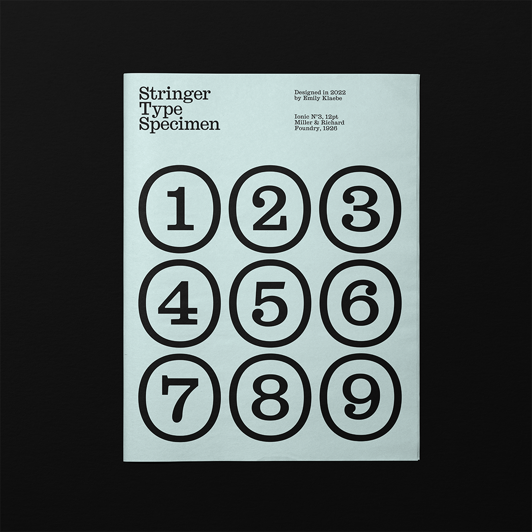
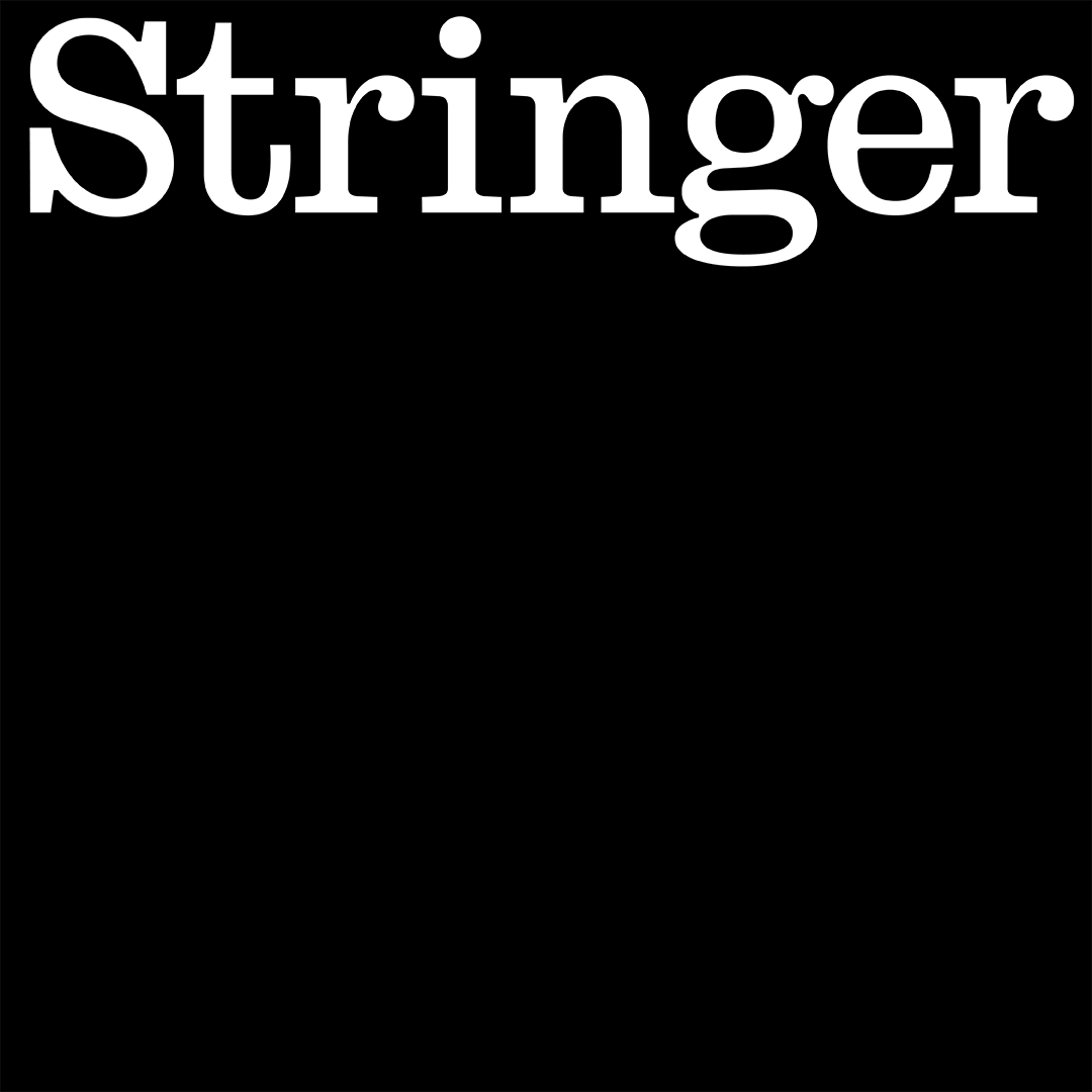
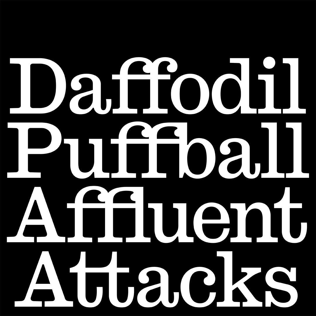
Stringer is a contemporary grotesque slab style serif, revived from the 1926 version of Ionic No. 3, by the Miller & Richard Foundry.
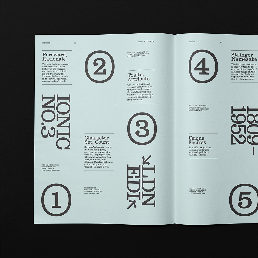
In 1926, the Miller & Richard foundry contributed to the Ionic family legacy with their release of Ionic No. 3. Miller & Richard was a global metal type foundry, based in England and Scotland. The foundry’s practice was in operations from 1809 to 1952. Their interpretations of the Ionic family maintained the overly wide serifs, large x-height, and ball terminals found in similar Clarendon-esque designs of the era.
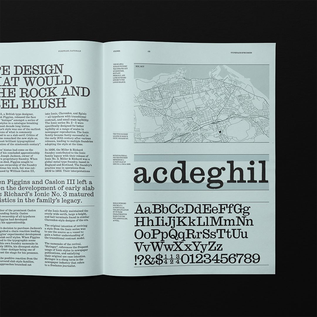
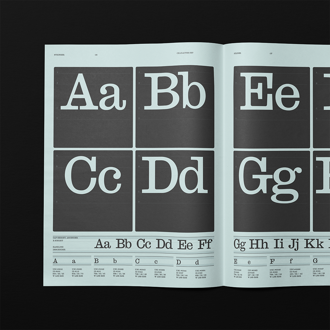
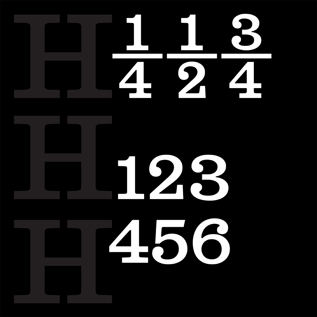
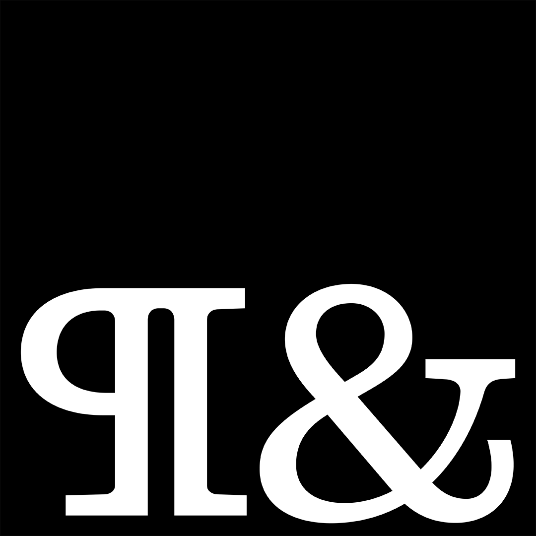
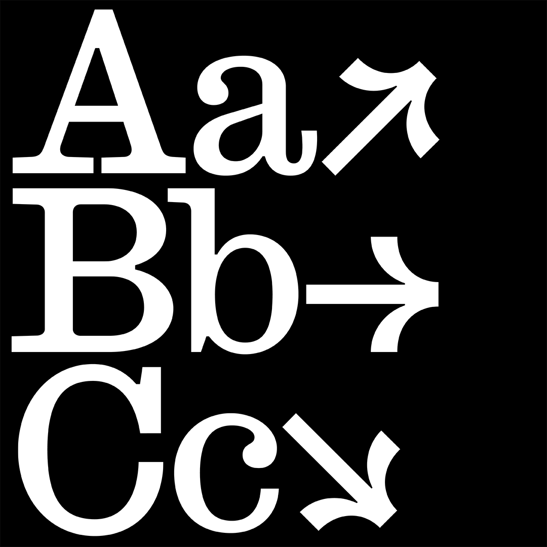
The original intention of reviving a style from the Ionic series was to use the source as a vessel to gain a better understanding of the transitional contrast model. Creative liberties were taken to enhance key characteristics associated with this genre, and to further distinguish it from being a literal revival. These decisions include, amplifying the upturned tail of the “a”, “R”, and “Q”, emphasizing the curved join into the ball terminals, and extending the bracketed slab serifs into glyphs that were previously non-existent in the source material, such as arrows and additional ligatures.
The namesake of the revival, “Stringer”, references the frequent usage of Ionic styles in newspaper publications, and satisfying their original use case intention. Stringer is a slang term in the newspaper industry that refers to a freelance journalist. One theory behind the slang term’s origins is that a piece of string would be used to measure the length of the journalist’s article — the longer the article, the higher the payment for the freelancer.

Emily Klaebe
Emily Klaebe is a graphic and typeface designer specializing in identity systems, typography, print design, and exhibitions. Relying on the principles of systems thinking, she designs typefaces and brand identities that are founded in thorough research, strategic thinking, and emotional connection.
