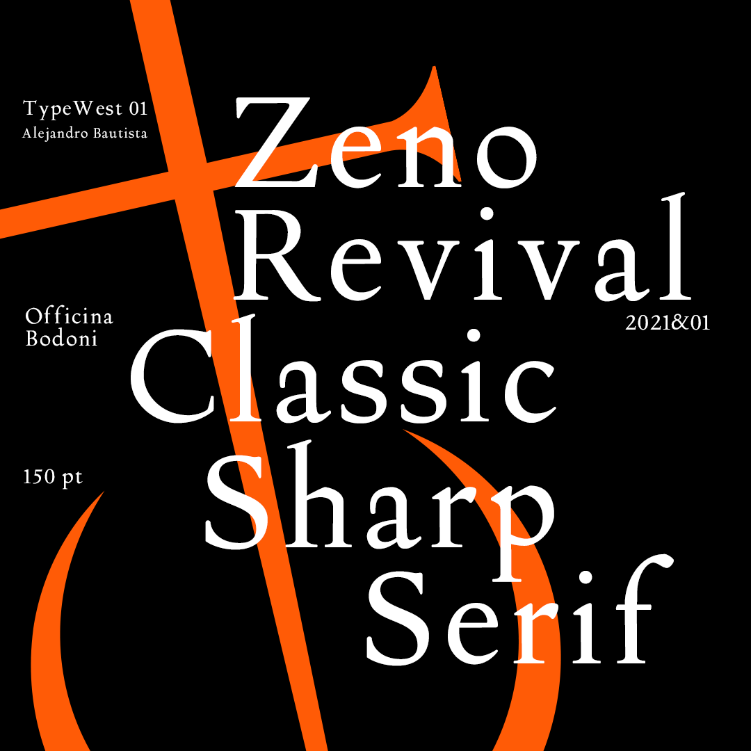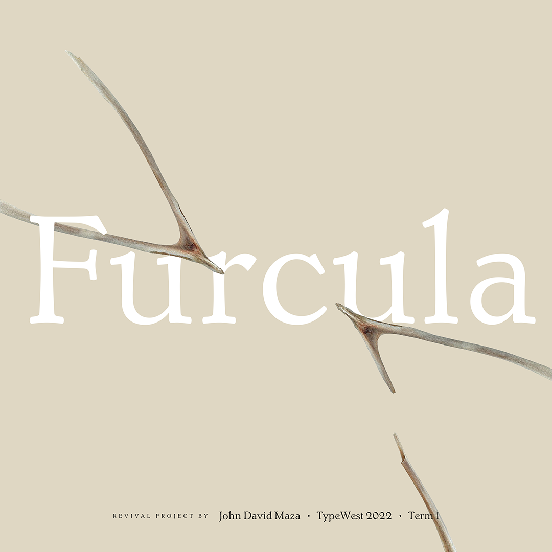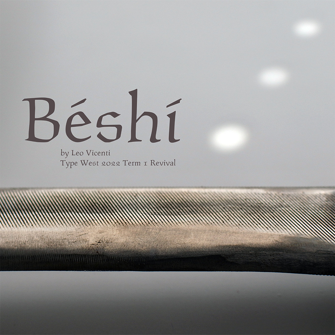
Type West Online, Term 1, Spring 22
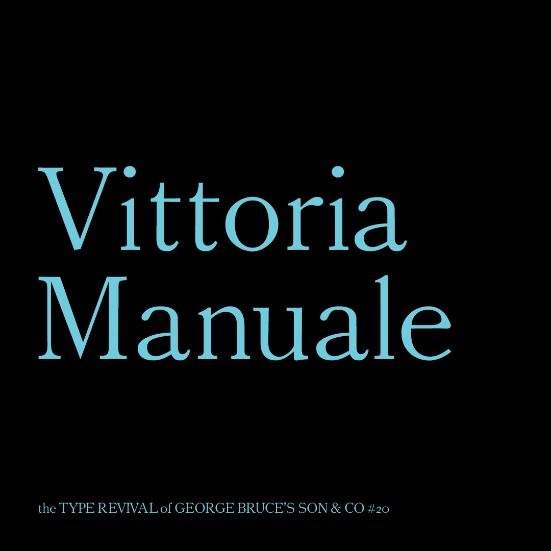
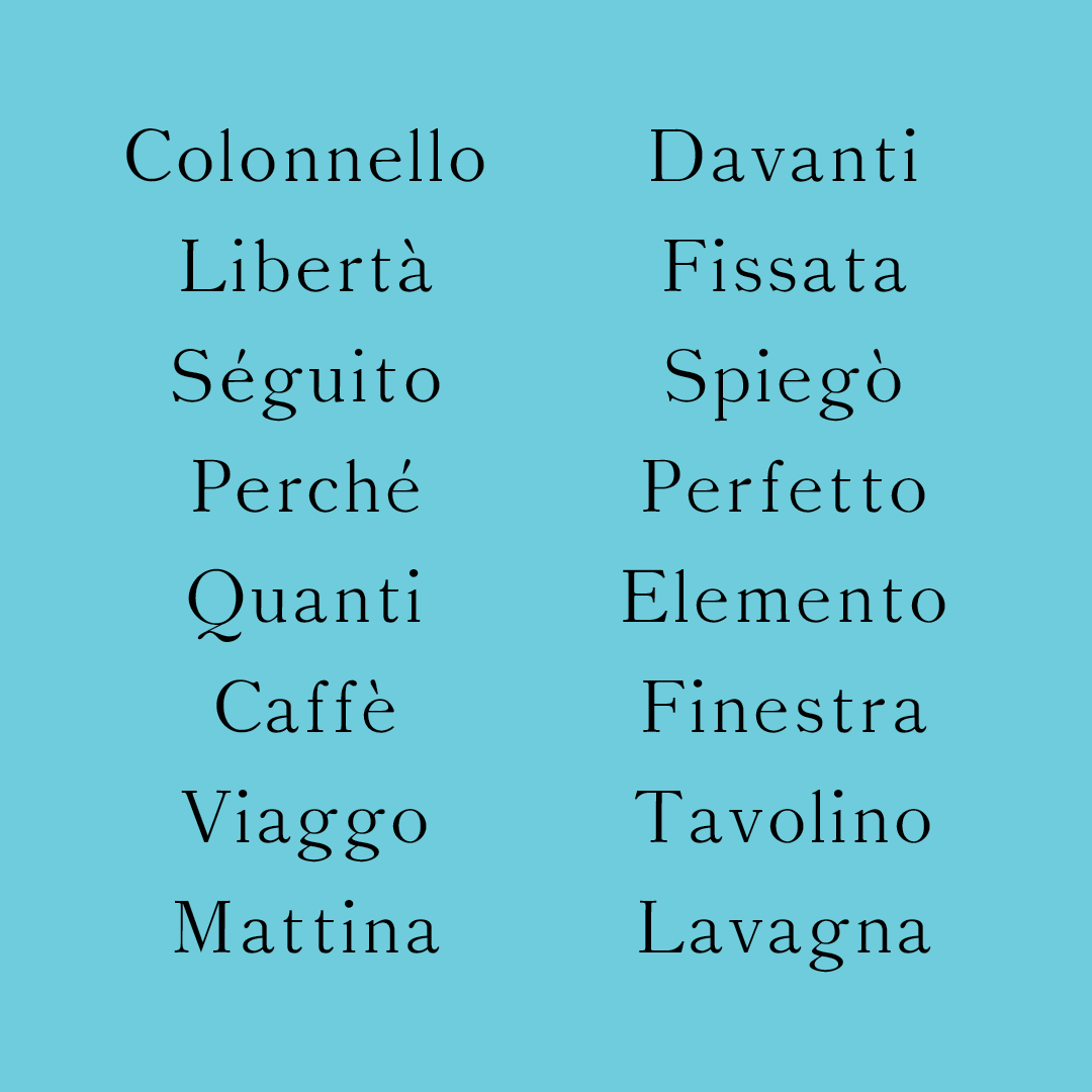
Vittoria Manuale
Gina Roi
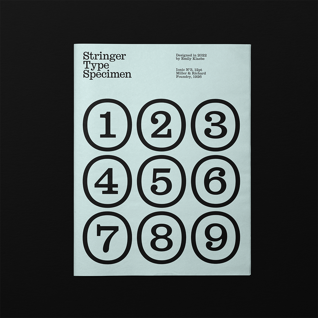
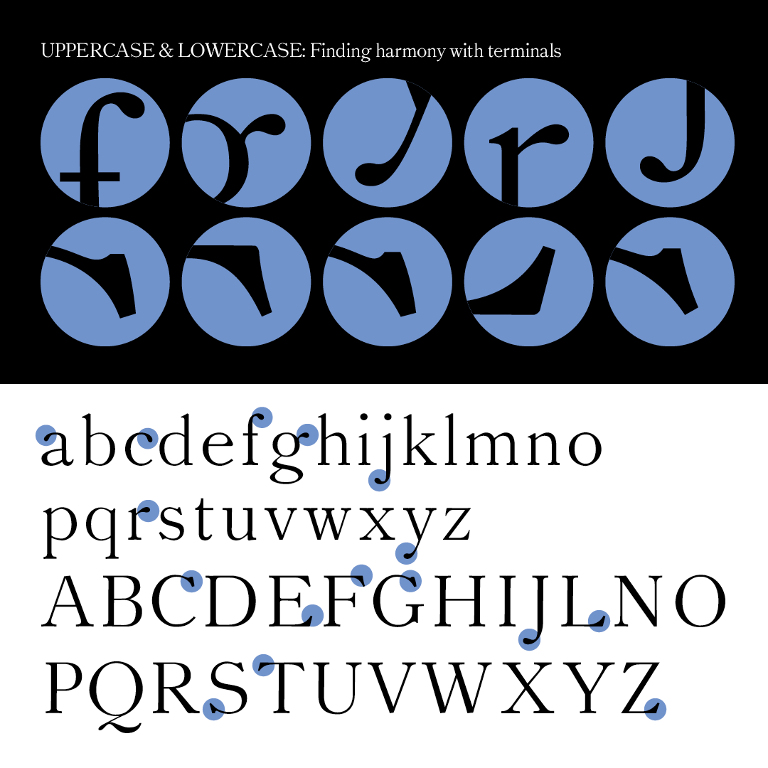
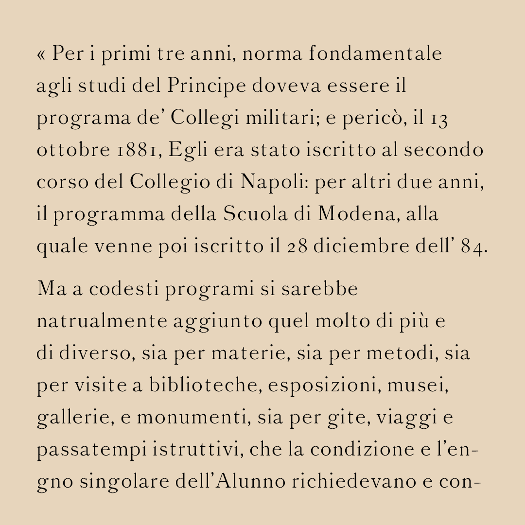
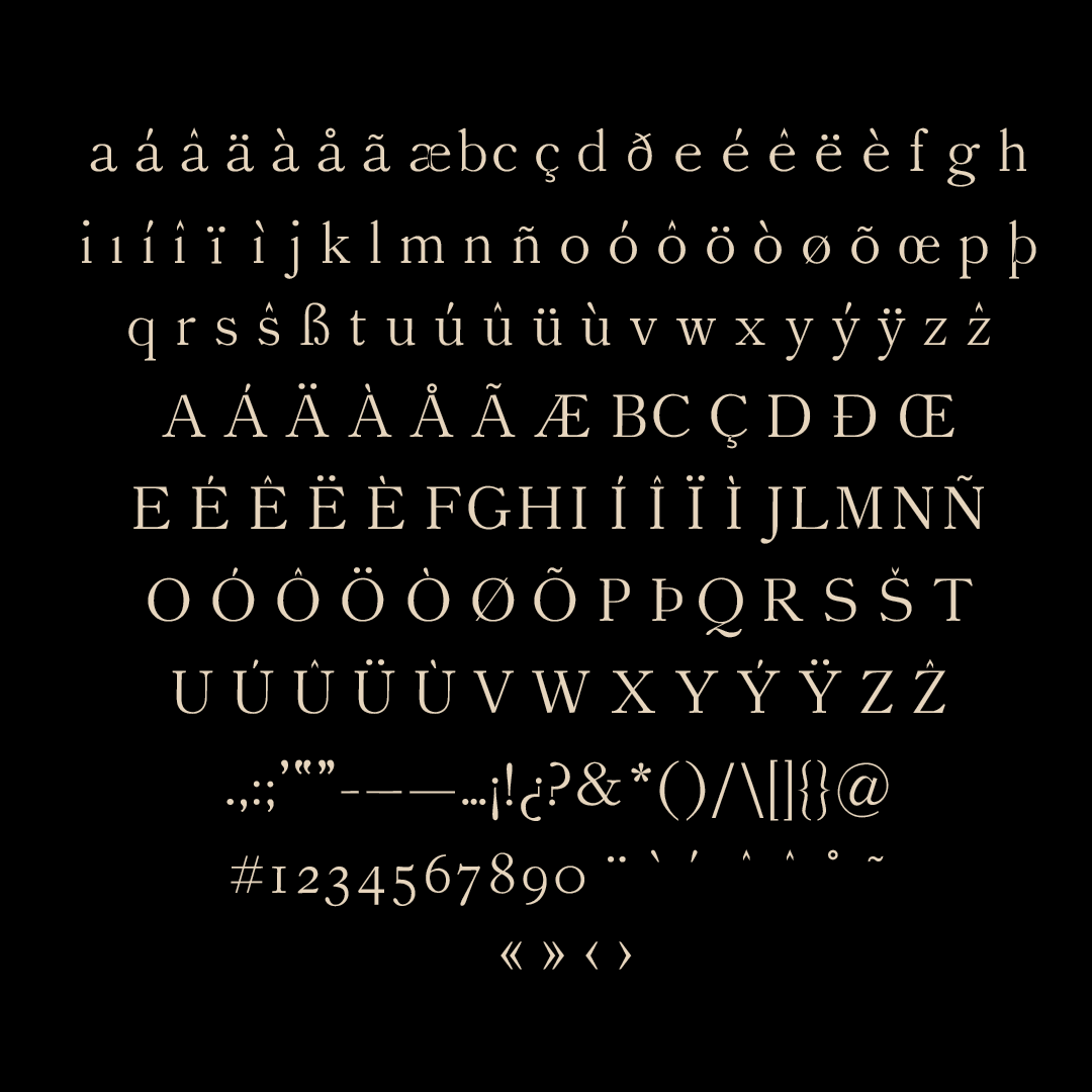
Vittoria Manuale means “Manual Victory” (in google translate Italian) and this typeface was just that for me! The revival is based off of a New York City type foundry, Bruce’s Son & co’s #20. I found a book printed in 1901 at a bookstore called “Come fu Educato Vittorio Emanuale III” about how the last King of Italy was educated. I have a much bigger appreciation for text typefaces that I didn’t expect. There are patterns and harmonies between letters I never noticed before and I’m excited to discover even more.
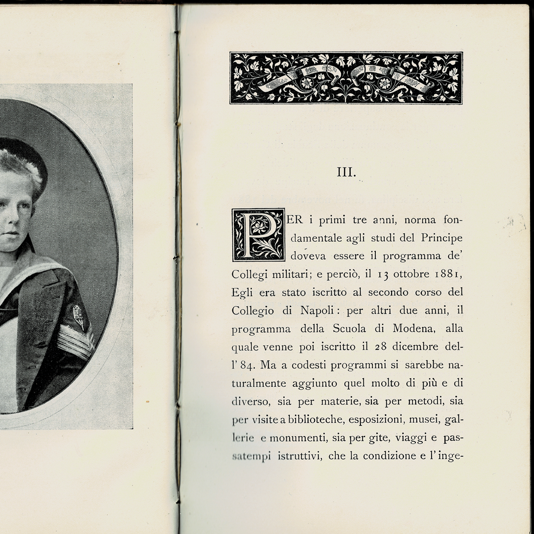
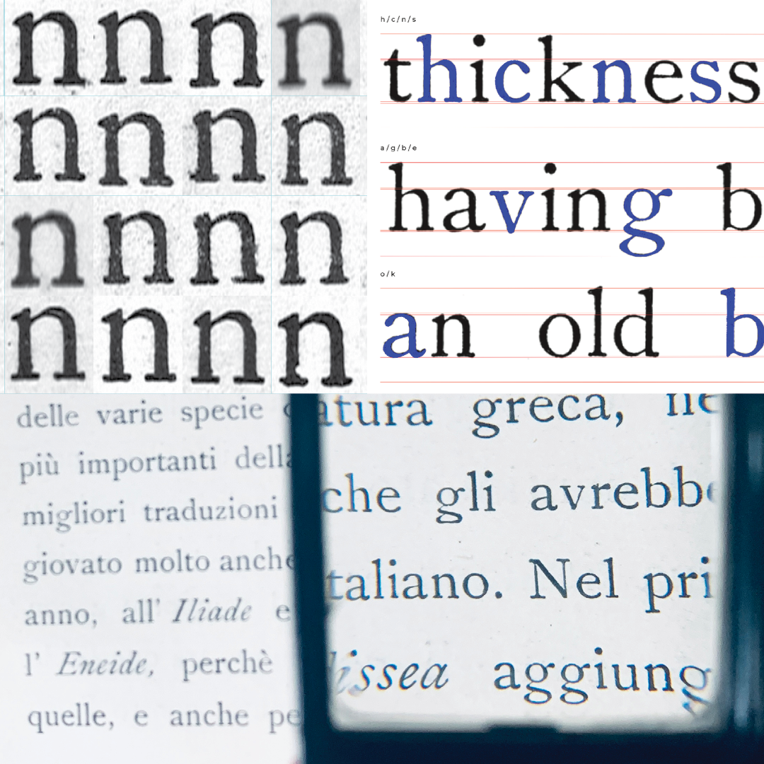
My research began online and then I decided to find a source in person. For my first typeface, this was super useful to have a whole book of my specimen, especially to observe spacing and punctuation. I experimented with Glyph Collector, traced over the letterforms of some words from the book, and used a magnifying glass to get to know each form.
Gina Roi
Gina is a designer in New York City who loves working on projects that have anything to do with lettering, sustainability, and food. With a strong foundation in branding, she enjoys exploring how far an identity can expand throughout different mediums. Currently she is exploring type, lettering, and motion design.