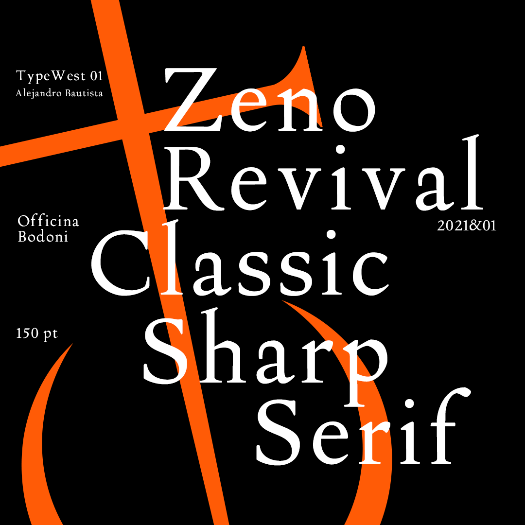
Type West Online, Term 1, Spring 22
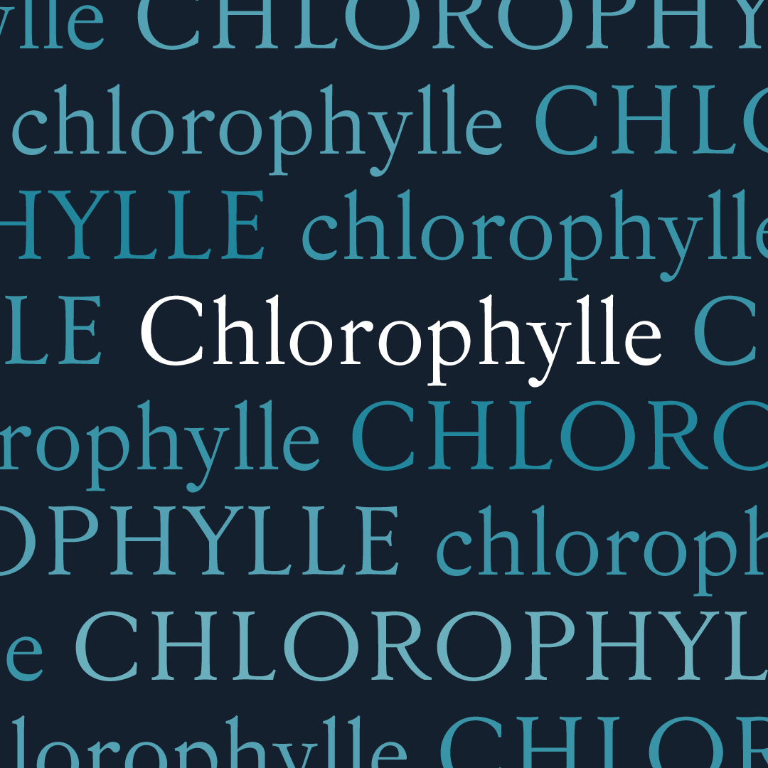
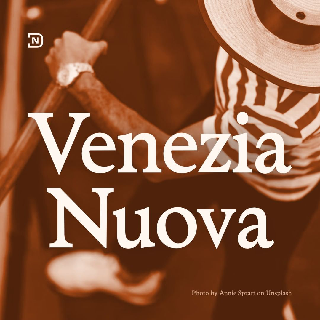
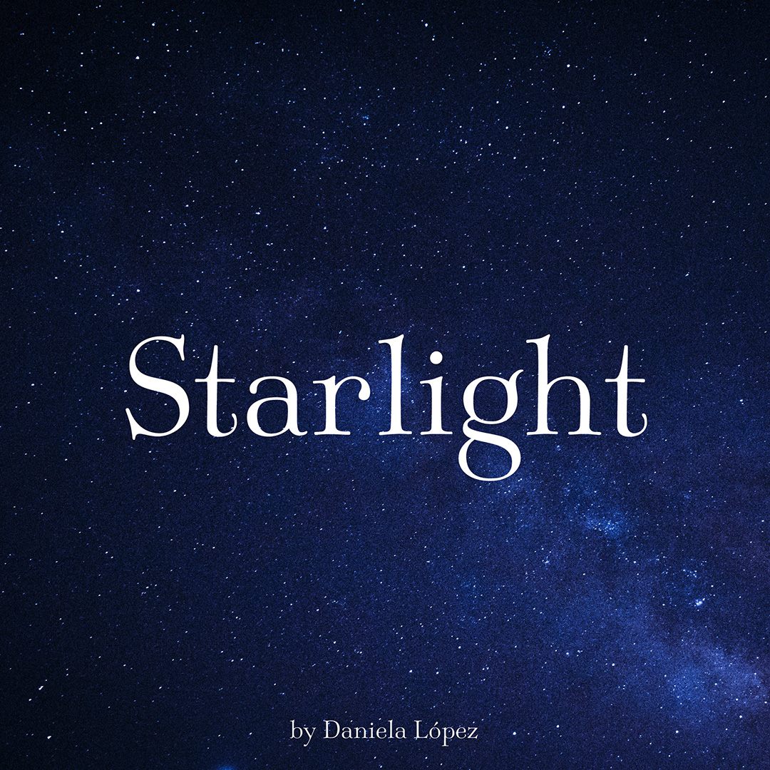
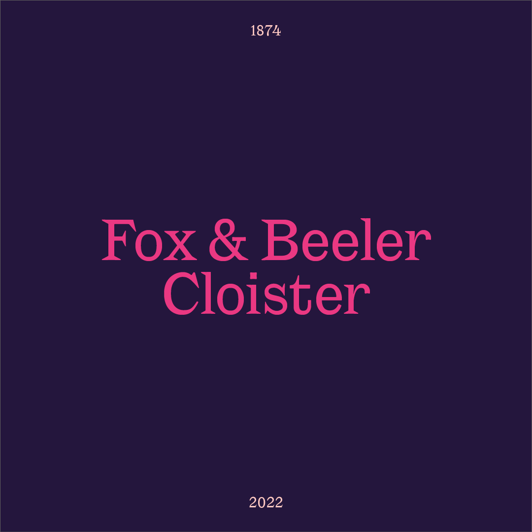
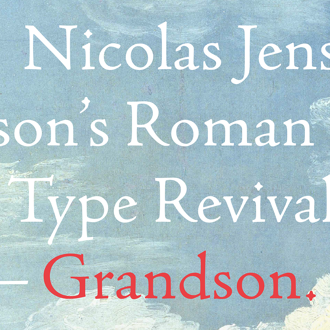
Grandson
Jessica Kao
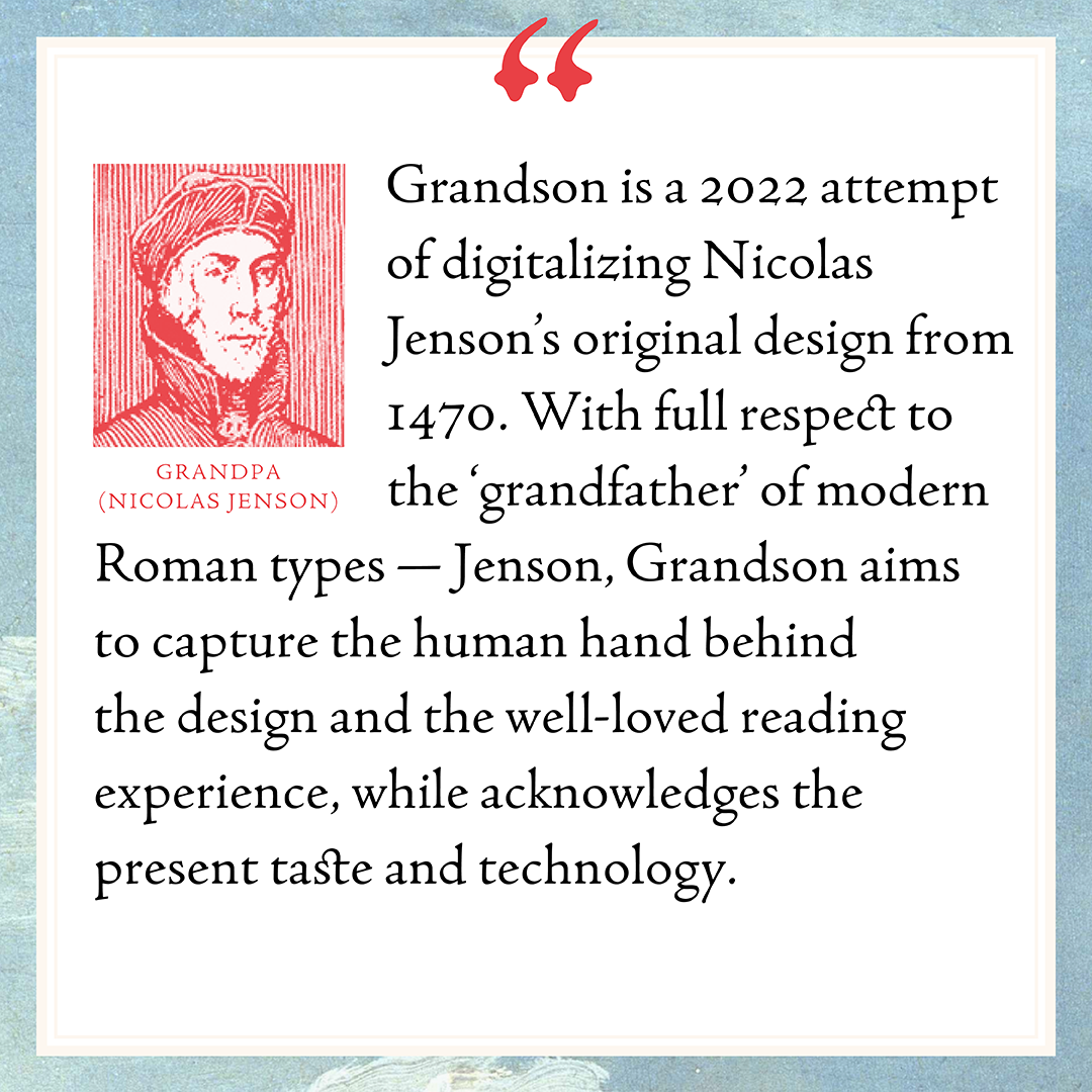
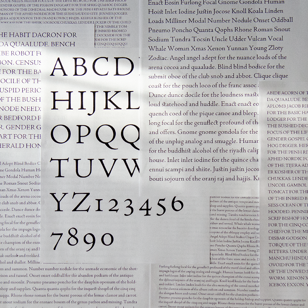
Grandson is a revival type of Nicolas Jenson’s Roman, particularly using the high resolution scans of Eusebius of Caesarea, De evangelica praeparatione, printed by Nicolas Jenson in Venice, 1470, and provided by Bridwell Library Special Collections, SMU.
At first glance, one might not find Jenson’s Roman too special. Indeed, it is hard for modern eyes to grasp the significance of Jenson’s work without any context. However, it is Jenson’s Roman that laid the foundation and became the model of our modern Roman, which includes combining Roman Capitals with minuscules, and establishing how the letterform (that we are taught with and still using today) should look like. Jenson’s Roman was so ground-breaking and so well received in its time that not only did it spread throughout Europe quickly, but copies of it and copies of the copies of it sprung up within a decade, and continued to bloom and populate long after Nicolas Jenson passed.
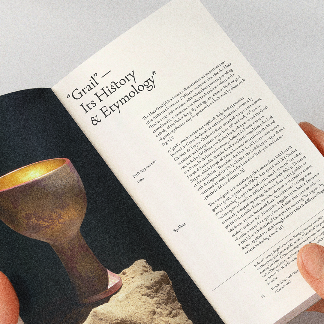
In my initial research of finding a typeface to revive, I went through many books and specimens and bookmarked everything that caught my eye, so that I could go through these marked pages to narrow down my choices. When I finally put down the last book spread I marked, I was only to realize it was yet another printed work using a typeface that was either inspired by Jenson or used Jenson’s type. It was very clear to me then, that Jenson, the holy grail of Roman type design, was where I should place my focus.
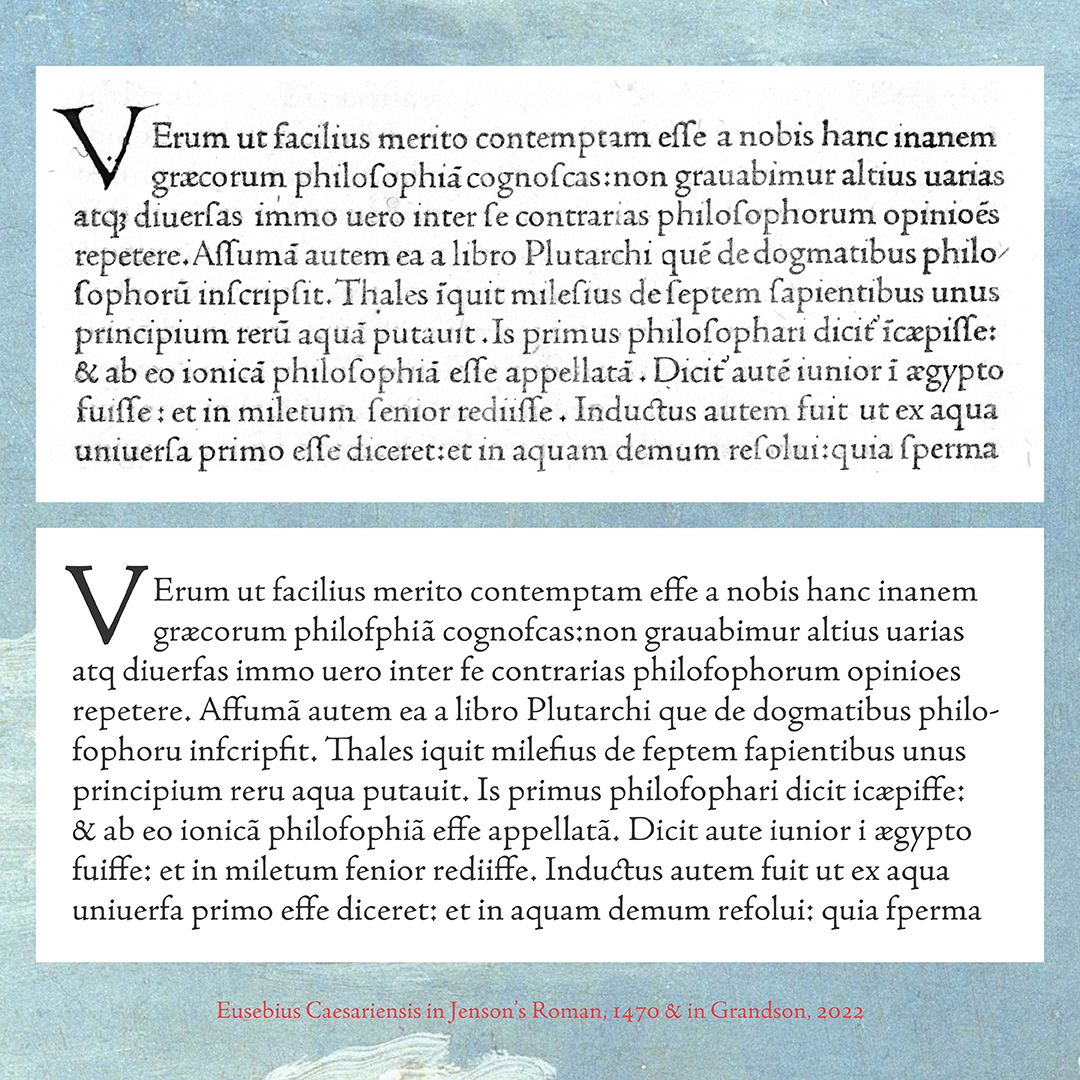
A page of Eusebius of Caesarea might offer a clear impression, but soon after I started the project, I realized that even though I had thousands of samples of most characters, no glyph looked the same. Take a lowercase ‘a’ for example: if a few a’s appeared on the same page, they must be printed out of different pieces of type that might have very slight variations. Additionally, the complex interaction among the ink, vellum, the position of types and its placement on the paper, and the distribution of pressure in the printing process all contributed to the various organic details of the final print result. Furthermore, preservation also left an impact. And these books printed in Jenson’s Roman are all that we have — no original metal type, metrics, punches, or drawings are left, nor did Nicolas Jenson write about his design intent and decisions.
Therefore, the biggest challenge was to crack the ‘magic’ of Jenson — what makes it ‘Jenson’? Why has it been so well loved and why am I attracted to it? How can it produce such a calming, clear, and warm reading experience? The difficulty laid in reading the samples to imagine what the original might be, and finding the fine balance between faithful tracing and creating faithful perception.
Here are some methods I tried during the process: I printed out enlarged samples of the same glyph and compared details of different glyphs to discern what was part of the original design and what kind of calligraphic gestures that they indicated; I experimented with a few tracing techniques, from exact tracing to liberal interpretation; I studied ink spread and various types of papers, and practiced calligraphy on top of Jenson’s ductus to emulate the shapes; I also compared other masters’ revival of Jenson’s Roman, to help inform my reading of the form and make my judgement.
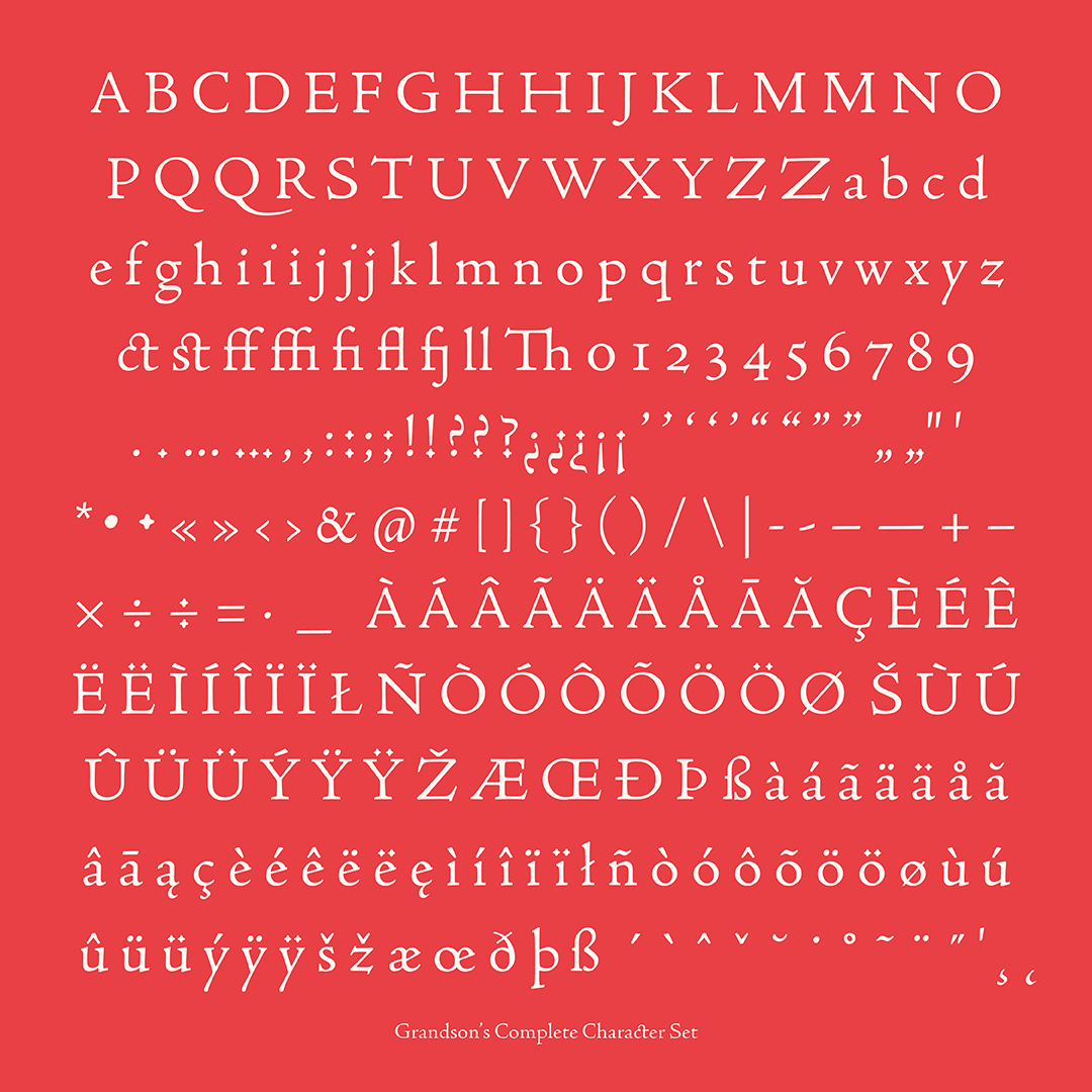
With much help of Juan Villanueva, Carl Crossgrove, and Christian Schwartz, eventually I arrived at Grandson. Grandson sticks to the original design as much as possible but also focuses on the impression. It combines sharp and rounded corners to balance the coldness of digital drawings and to preserve the warmth of the print effects. It also takes notes of calligraphic details, and looks to recreate the original reading texture and rhythm of Jenson. Very different from most modern typefaces, Grandson does not use any modular pieces or ‘building blocks’. No serif is the same in Grandson, just like no two calligraphic strokes are the same. Instead, Grandson focuses on how each glyphs relates to each other, and seek harmony and consistency through proportion, gestural details, optical adjustment, broad nip pen influence, as well as the nature of vectors.

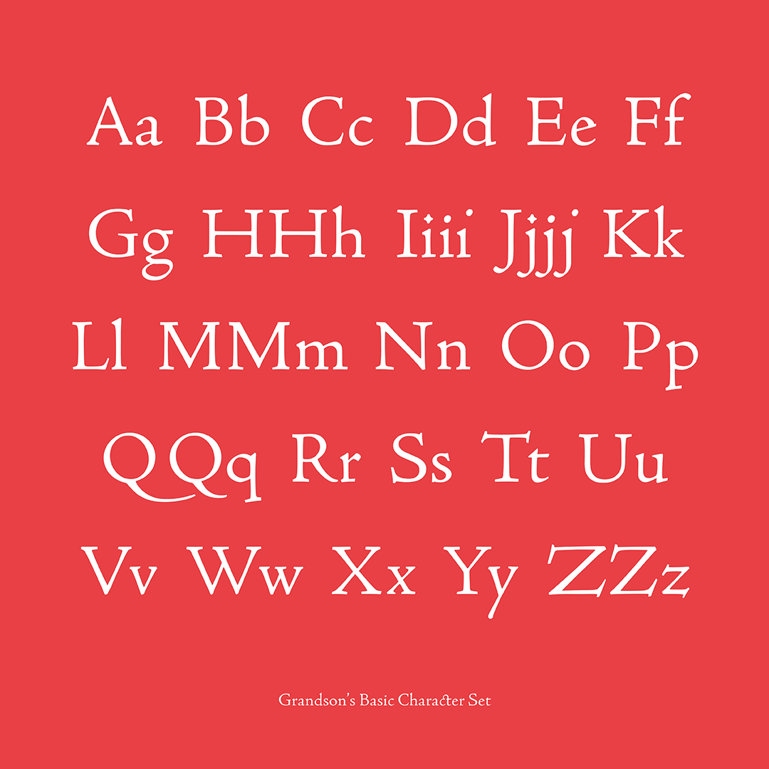
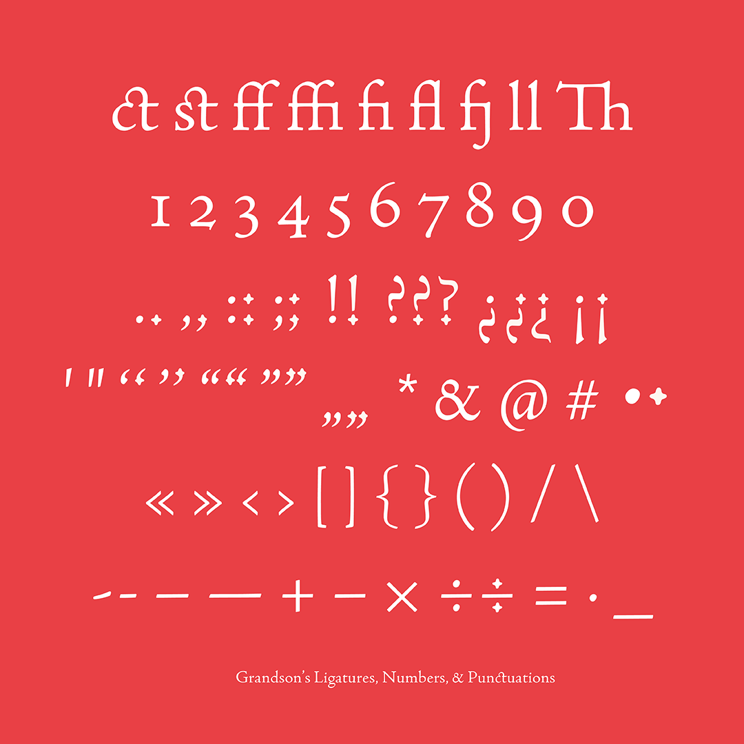
Some of the missing glyphs, such as uppercase K, J, U, W, Y, and lower case j, k, v, w, are created based on the common style of the era or Venetian type. Some — such as numerals, diacritics, and most of the punctuations — are invented by referencing the existing characters of Jenson and calligraphy. Necessary adjustment and extension of the original character set are made to help Grandson to be a functional typeface.
Grandson pays its deepest homage to Nicolas Jenson. It aims to serve our modern readers in 2022, while celebrating Jenson’s beautiful creation from 1470 and the history of letterforms.
Jessica Kao
Jessica Kao is an art director, designer, researcher, and educator interested in a practice across disciplines. She designs with a holistic approach, while at the same time bringing a unique perspective to projects. Whenever she can, she speculates and blends in whimsy!
Currently sun-baked in Los Angeles, Jessica has worked internationally and locally in collaboration with a diversity of clients. Please email her at hello@jessica-kao.com to inquire about her work or simply to share a conversation.